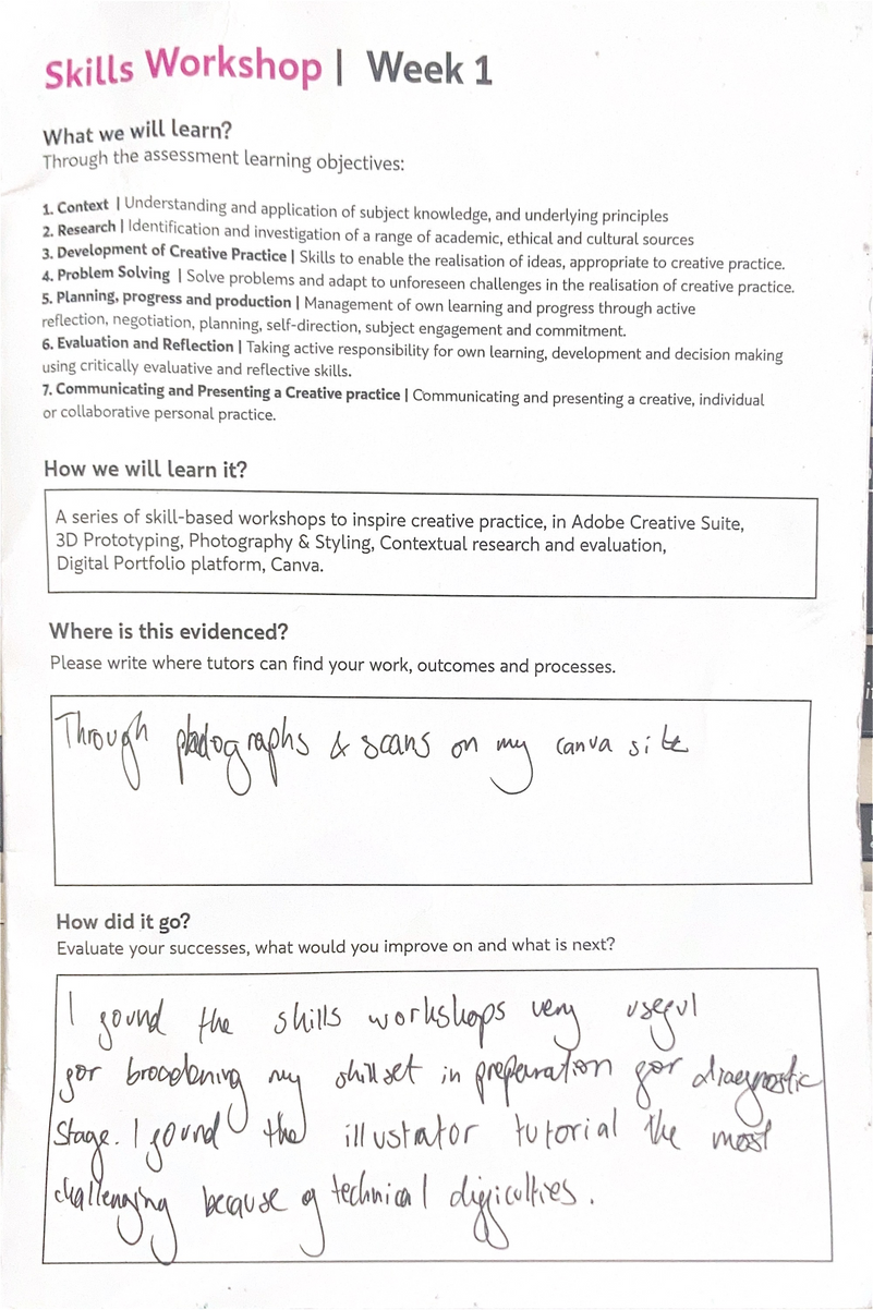
Skyla Rogers
Unit 1 Diagnostic Practice
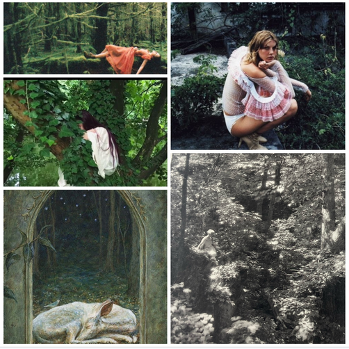
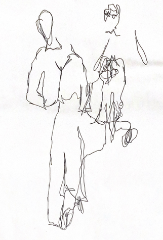
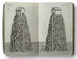
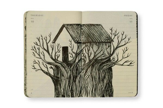
Summer Project
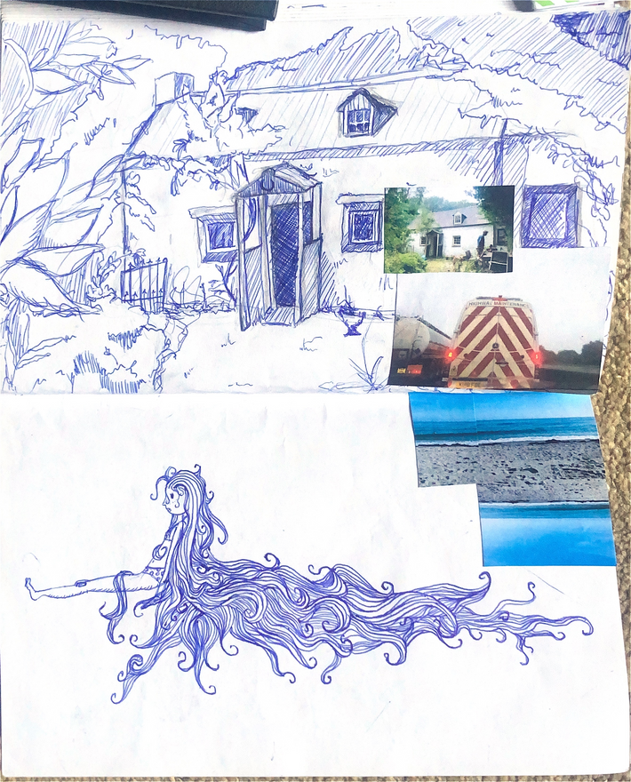
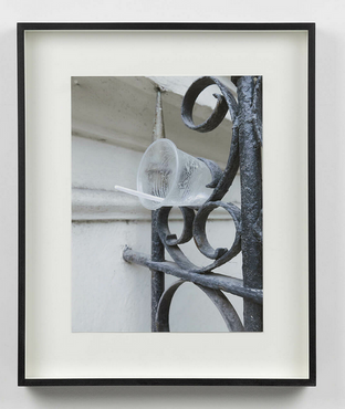
I emptied my biro pen throughout the summer and I documented this journey with images of where I was when I drew it.
Partially observational, once I was just working from a photo I found my proportion became less accurate
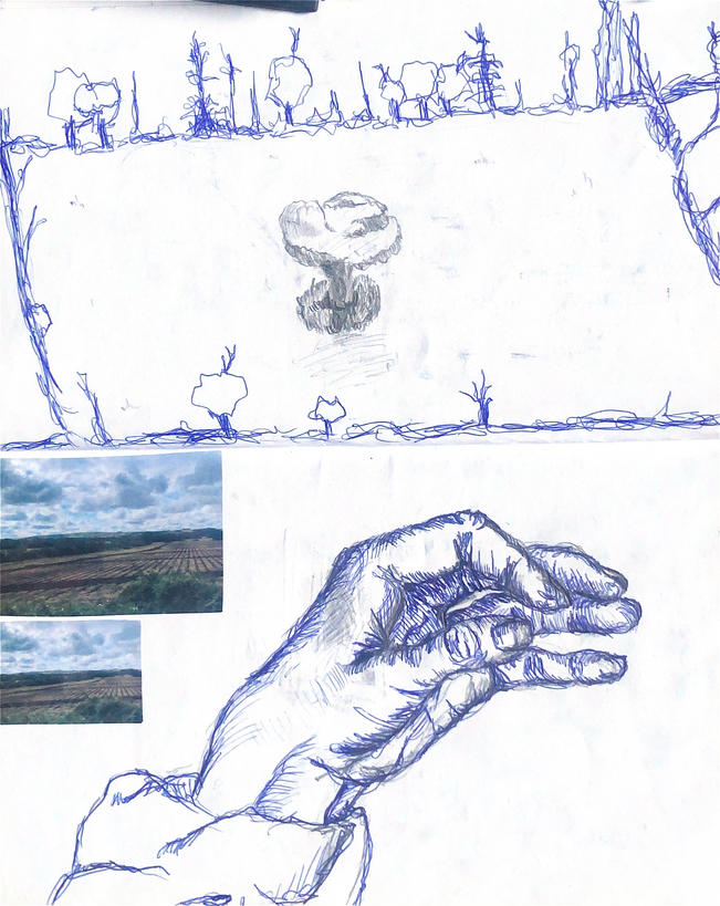

Reflection on summer project:
I think the summer project allowed me to see a connection between my drawings and my surroundings and I was able to see how my location and the people I was with effected the art I made.
If I were to do it again, I would add more observational drawings to further document my summer through the lense of location.
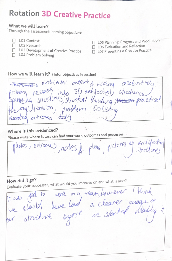
Skills Week
Material and primary research
04
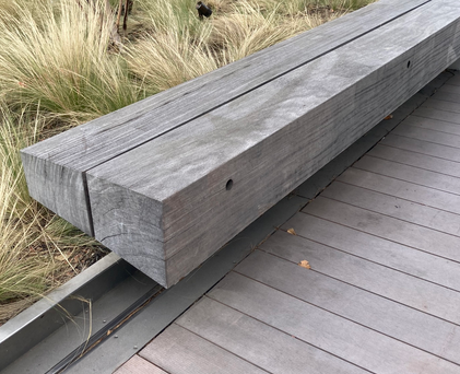
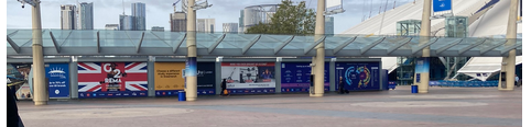
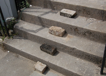
We walked around the local area, paying attention to the materials used in the structures around us.
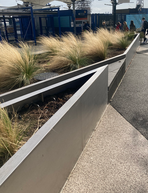
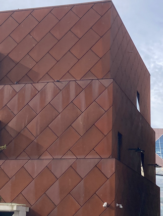
Man-made casing
Organic: Wood
Man-made: Metal
Reflections
Fom this activity I learnt about how aestetics are part of the decision making process when designing a building. In particular, I began to notice how frequently casing was used on buildings, serving only an aestetic purpose.
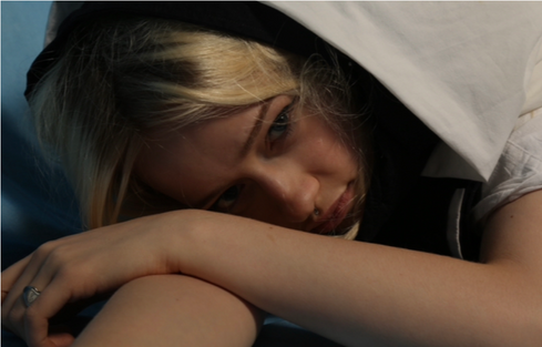
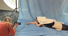
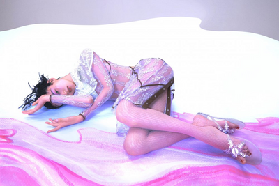
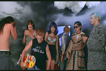
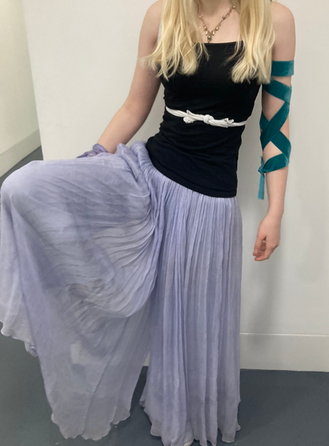
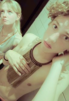
Photography and styling session
When exploring the concept of “alluring”, I found I was most drawn to photos with rich contrasting colours. I thought that slightly unnatural colours and poses were alluring. It was important to me that the model was making eye contact with the camera to draw the viewer in.
Reflections on my Photos
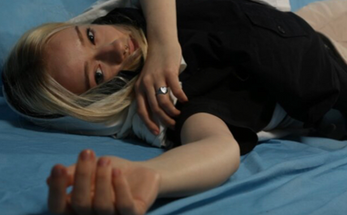
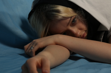

To create an “alluring” contrast of colours, I layered fabrics so there was a darkness surrounding the models light hair, drawing the viewer into her face.
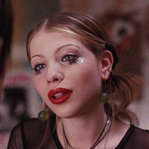
Mood Board
Hugo Comte
Paolo Roversi
Saha Elage
Ren Hang
I prefered the expression on the model’s face in this photo, however the styling would be highlighted better by a photo taken from further away.
Alexandra Carr
Research:
I was inspired by the colours used by Sasha Elage and Ren Hang. the almost expressionless faces of the Models used by Hugo Comte and Ren Hang were intriguing to me so I wanted to emulate this to create an alluring photo. Iwas also inspired by the unnatural angles used by Alexandra Carr and Hugo Comte. For styling, the material around the model’s head in Paolo Roversi’s photo drew the viewer into the model’s face, creating an alluring effect.
If I were to do the task again I would put more thought into how my styling connected to my concept .
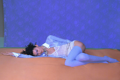
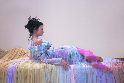
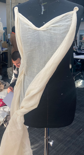
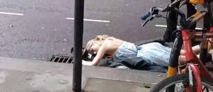
Photography and styling with natural lighting
Initial Photos
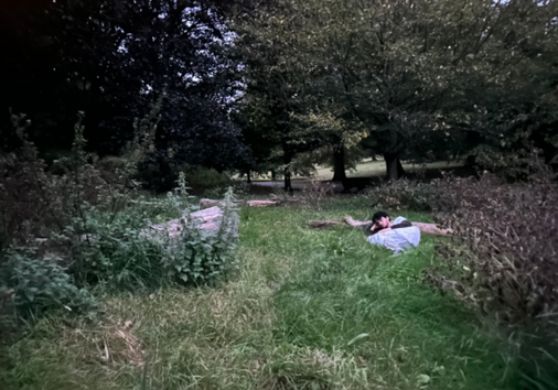
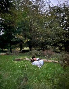
I was happy with the composition of this photo because the model wasn’t the central focus and the straight on, far away angle gave the impression that the model isn’t aware the camera is there, conveying tranquility.
Tranquil
I wanted to utalise the natural world and the tranquility it evokes in people. For styling, I wanted the fabric to wrap around the model to create a sense of safety. Like the photography of Clifton Adams , I didn’t want the person to be the focal point of the photo, instead blending into the background to convey how they feel hidden and safe in their surroundings.
While I like the dream-like quality of the darker lighting, I wanted brighter lighting to make the photos feel more fresh.
Chrissie White
Corinne Day
I kept the angle and position of my initial photos but retook them in brighter daylight. I changed the styling so the fabric wrapped around the model in a tighter coil to give ta sense of harmony. However, this makes the the white fabric stand out less which can make the model harder to see. Next time I would try and wrap the fabric in more of a cocoon way so the model stands out while still blending into the nature.
Refining
Claire Boucher
Presenting Creative Practice
Clifton Adams
Tetsuhiro Wakabayashi
Introduction to Adobe
We began on Adobe Illustrator, learning how to create basic shapes and add colours.
After creating our shapes on Illutrator, we learnt how to transfer them to photoshop and add other images on there. Here we also learnt how to remove backgrounds on images and use multiple tools.
Reflection
I learnt a lot from this workshop as I was very unfamiliar with Illustrator in particular. I struggled on Phooshop with removing all the background of images so I will have that to work on or next time. I would also like to try creating more complexed and appealing shapes on Ilustratornow that I have the basic skills.
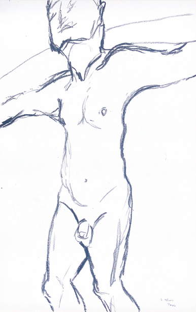
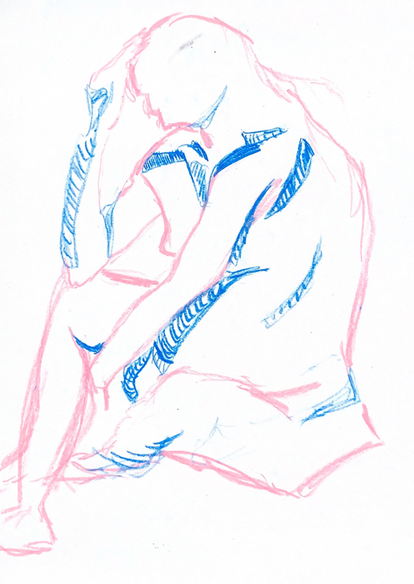
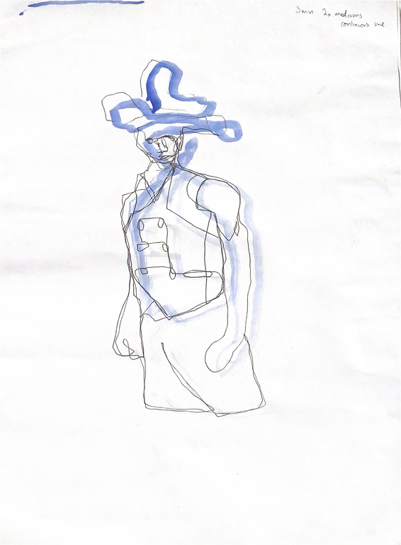
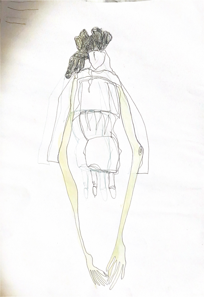
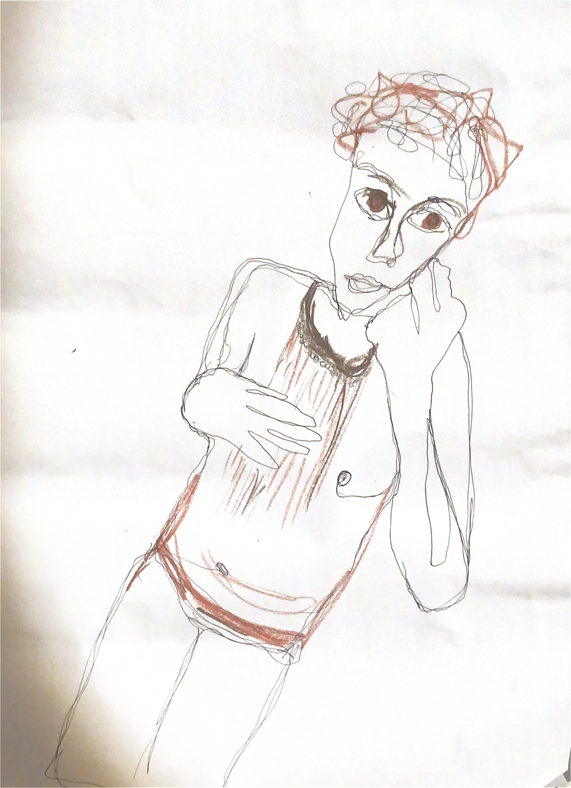
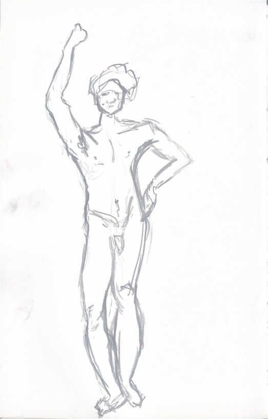
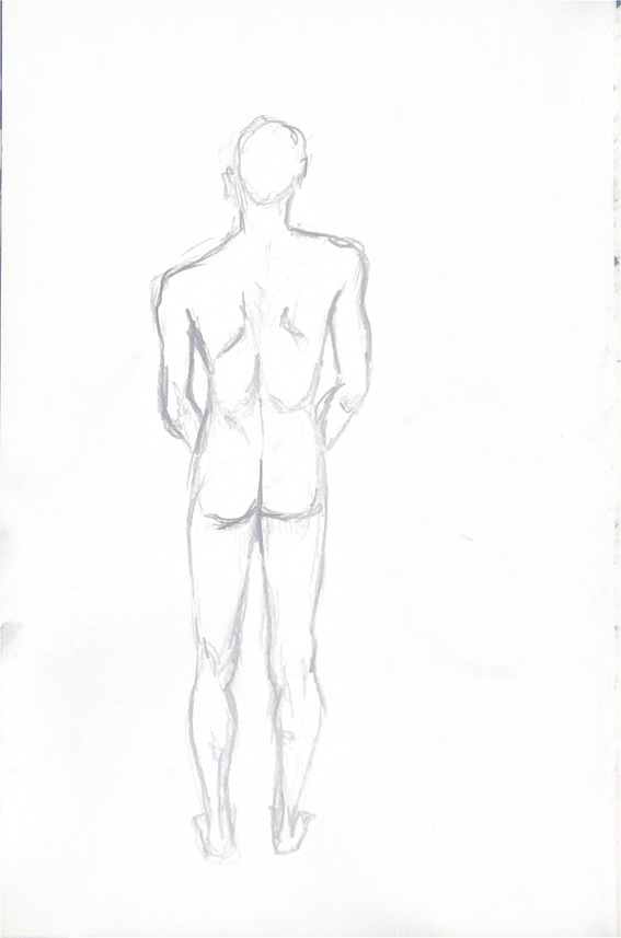
Life Drawing
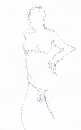
5 min Continuous line
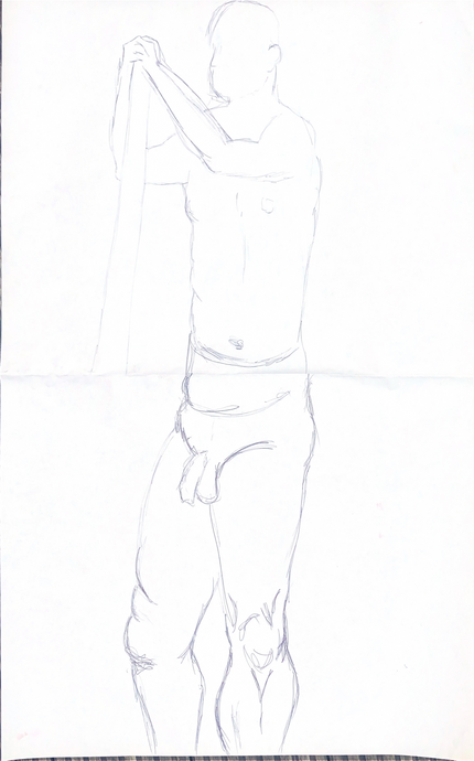
5 min not looking at the paper: this helped me to consistently check on my subject in the later drawings.
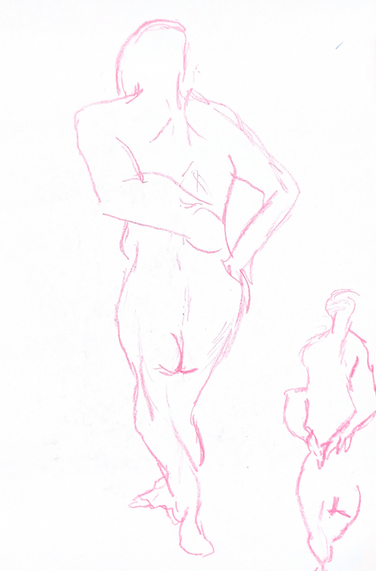
Switching with another person to do half of the body:
this helped me work on proportion, I didn’t perfectly line up with the top half.
Switching mediums from charcoal to oil pastel:
here I overestimated the proportions so couldn’t fit the whole figure
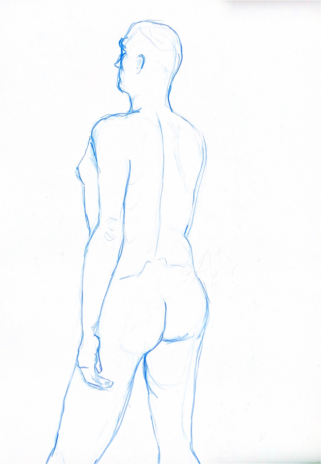
15 min colouring pencil, l was happy with the different pressures I used to create motion
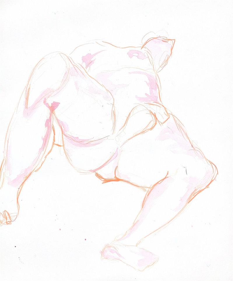
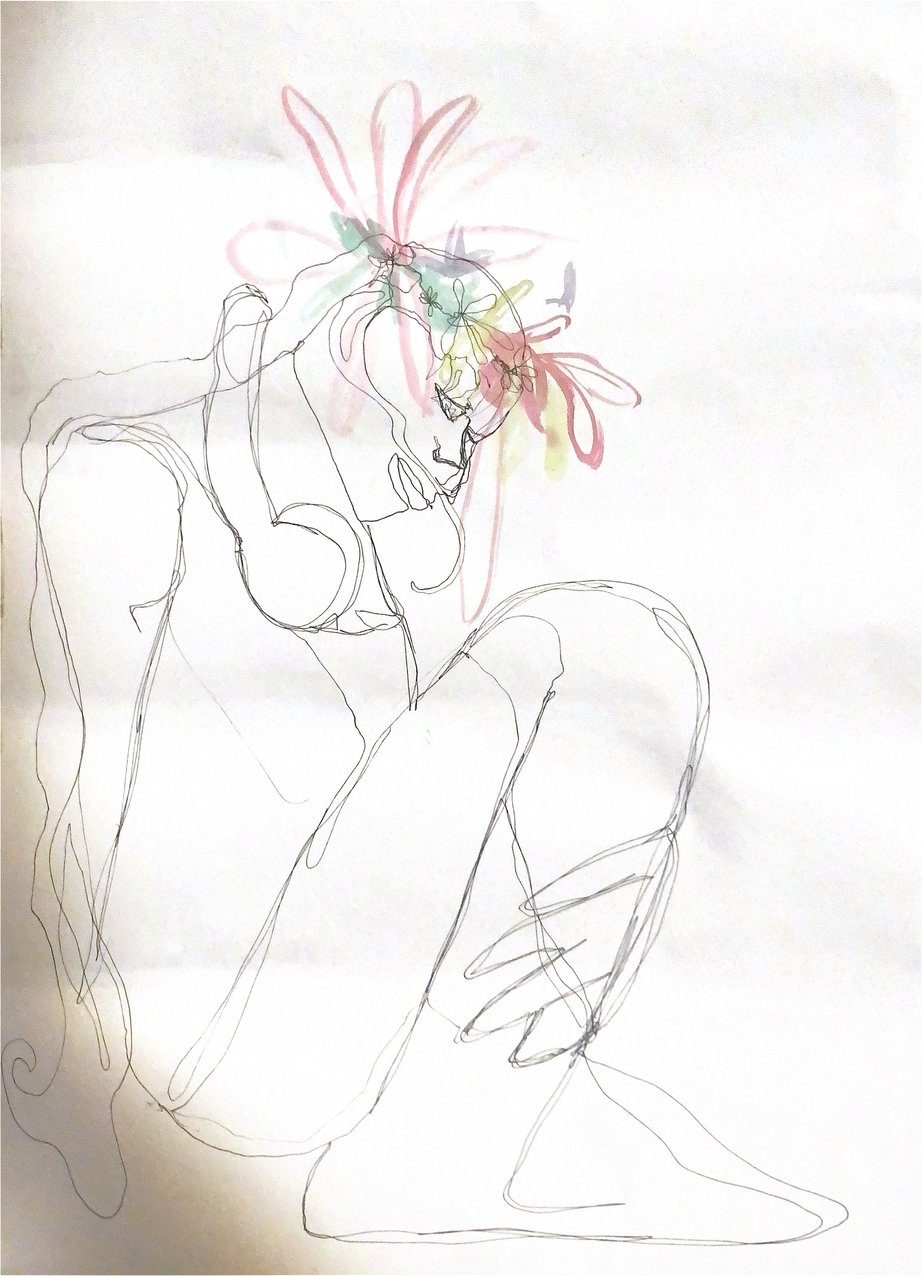
10 min colouring pencil and watercolour:
This pose was difficult to draw and challenged me to use forshortening
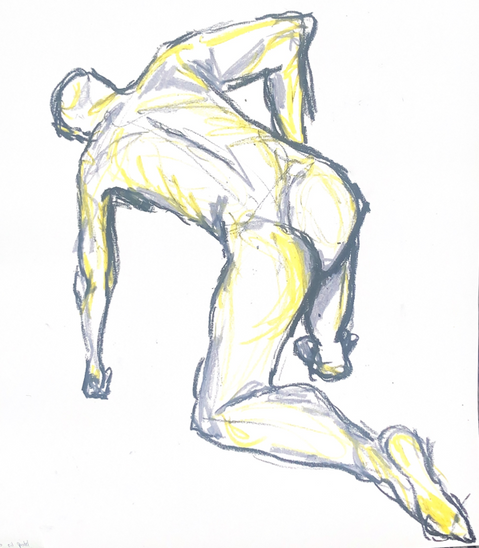
15 minute oil pastels:
I was happy with the proportions of this drawing and the motion created with the yellow highlights
Drawing shadows first, then adding the body:
This challenged me to focus on the shadows and I found it difficult to draw the correct proportions after.
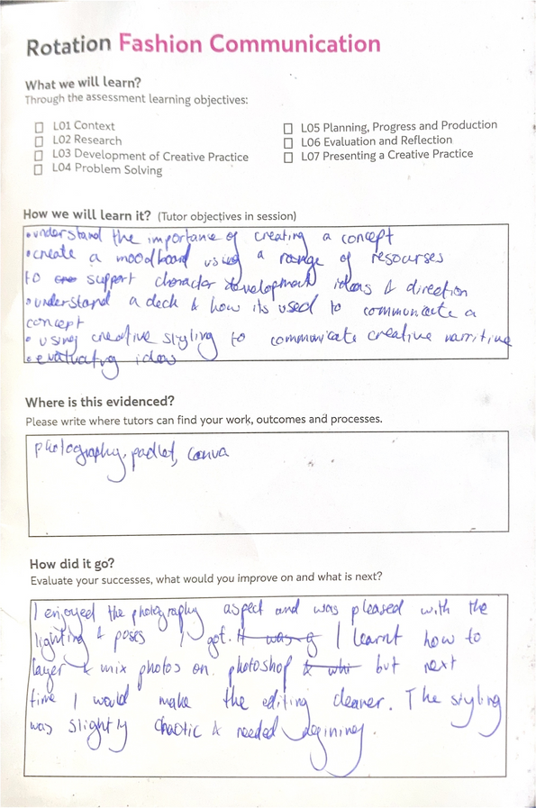
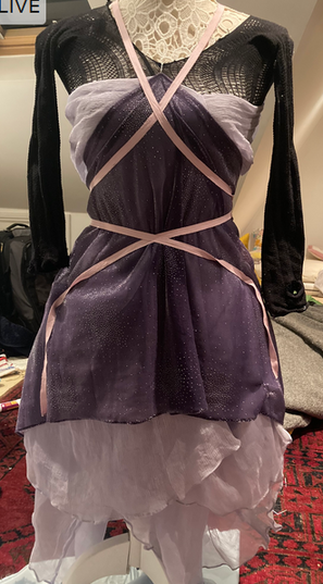
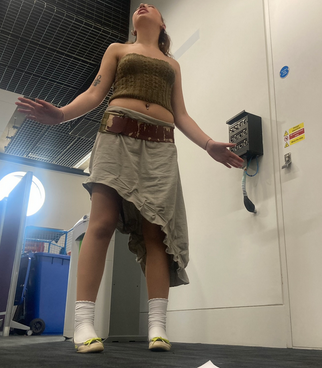
Fashion Communication Rotation
Context
I chose to reimagine the character of the Changeling from Welsh folklore. I chose this story because I was read it when I was little and it used to scare me, but reading it again now I found myself pittying the Changeling. In the story the fairy people steal a human child and replace it with one of their own that they don’t want: a changeling. The changeling doesn’t fit into the human world and is disruptive and miserable. While the original story focuses on getting the human child back from the faries, in a modern retelling I think it would be about the emotional journey of the changeling.
The Changeling
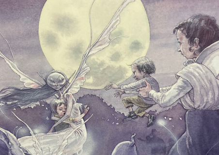
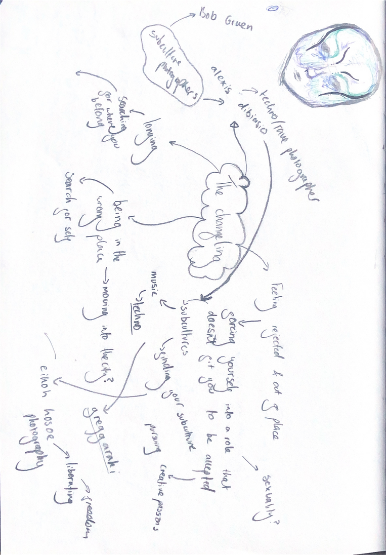
My changeling has a happy ending, finding a place it feels it belongs within modern day subcultures.
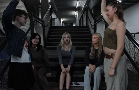
Word assosiation peer task:
When shown a picture of my characterr, my peer ssociated iit with the words outccast and different. This strengthened my concept and reinforced my modern day interpretation of the character.
Planning and Progress
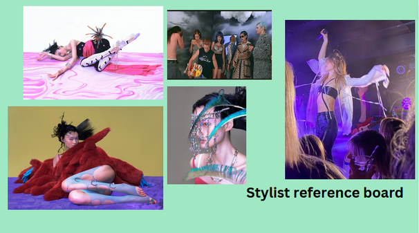
Creating a moodboard
Alexis Dibiasio
These photos capture the lively emotions I want the photos to evoke, capturing the freedom the changeling feels in the modern reimagining. I also felt that these photos captred the sense of community that the changeling finds.
Eikoh Hosoe
Gregg Akari
Harry Shunk,
Bob Gruen
Eikoh Hosoe
Using imagry to convey a character:
My character doesn’t have specific imagry asociated withthe original story, this initially made it difficult to select a style for the character. I decided to associate it with imagry surrounding the punk and rave cultures as they connect to the liberating emotions I want my character to have.
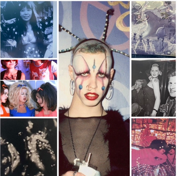
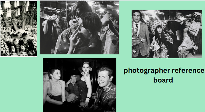
Reference boards- Planning
Research
:Photographers
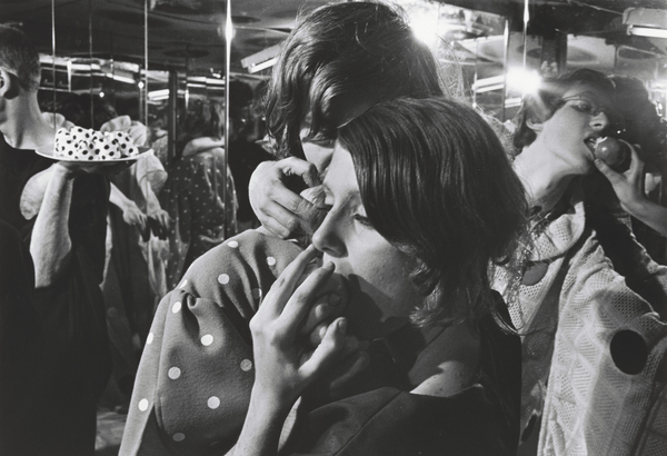
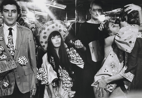
Harry Shunk, János Kender
Harry Shunk and János Kender documented Yayoi Kusama’s Mirror performance in 1968.
The performance piece explored US society at the time. I liked the photos becuase of the natural poses of the subects and wanted to emmulate this in my own photos.
Alexis Dibiasio
When researching photographers who explored rave culture, I discovered Alexis Dibiasio who documented the outfits and attitudes of 1980s-90s N ew York ravers. The alternative and experimental styles of the subjects he captured helped form my ideas of visuals for my character as many were considered outcasts like the changeling.
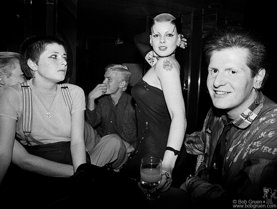
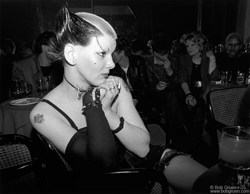
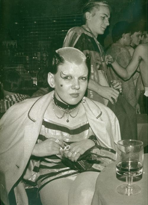
Bob Gruen
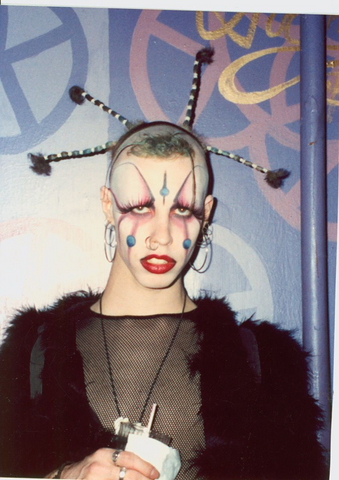
Bob Gruen wasa punk and rock and roll photographer during the 70's. I saw his photos in a book about punk bands and was inspired by the way he captured people’s personalities and individualism.
When looking at Bob Gruen’s photos I discoved Sue Ctwoman, a punk figure from the 70s. I was inspired by her alien-like makeup and individual style.
Inspirations for styling- Research
Sue Catwoman
The aestetics and themes of Gregg Akari’s directorial work influenced my stying for the photoshoot. The costumes and sets have contrasting patterns and the characters are often outcasts who have found community, similar to my reimagined changeling.
Gregg Akari
LEMON.H
The styling for the Marie Curie photoshoot (photographed b Zeng Wu) by LEMON.H inspired me because of the use of flashes of skin to create shapes and separation and the use of layering, as well as the appealing colour sceme.
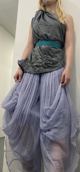
Initial styling ideas- progress
I took inspiration from the styles worn to modern day raves, with layered criss-crossing fabrics to incorporate the concept of subcultures as a place of freedom. I also took inspiration fromm the way LEMON.H used tights in unconventional ways.
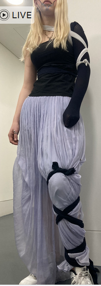
I liked the asymetrical design of this, and the patterns up the legs, however I wanted more complexed layers.
I liked the silloette created by gathering the trousers as it conveyed movement
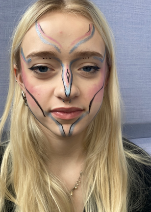
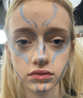
I took inspiration from makeup of Sue Catwoman, following the contours of the face to draw upon the fact that the changeling would have been part of the fairy worl if it had been wanted. This first design had too much detail which ended up looking too celestial, so for the photoshoot I choose the simpiler, blue design as it appeared more fae.
Makeup designs
Creative Practice Development- Styling the villain of the story
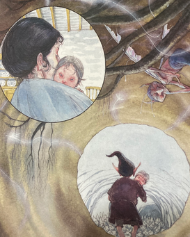
In the story, the fairy that steals the human child is the clearest villain and I styled an alternative look for this character. I took inspiration from th illustration from the origianl bookk I read w as a child, liking th lilac colours and flowing fabrics and wings.
I tried to elevate my original styling by adding more layers, however I think this made the design more clluttered than dynamic. Instead I should have added more to the wings to mimick the illustration.
What I learnt:
From this exersise I developed more ideas on how to give my changeling fairy-like qualities.. I also learnt to be careful when adding more details that they aren’t overwheming.
I used chiffon trousers to create the flowing wings and I was happy with the wing-like effect of this.
Test shoot
I altered my original styling ideas, adding tights as a shirt to create cut-outs, reminiscent of rave culture.
Problem solving
I wasn’t satisfied with the length of the trousers as I didn’t feel they conveyed the sense of freedom I wanted my changeling to have. This led me to restyling the trousers into a mini-dress.
Creating a deck
I learnt about how a deck can help communicate the vision you have for a shoot and when creating my own I was able to refine and specify what I wanted to create.
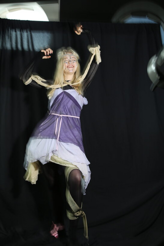
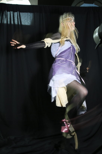
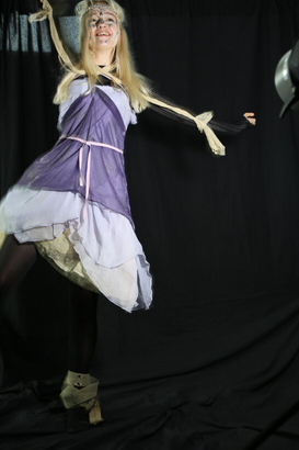
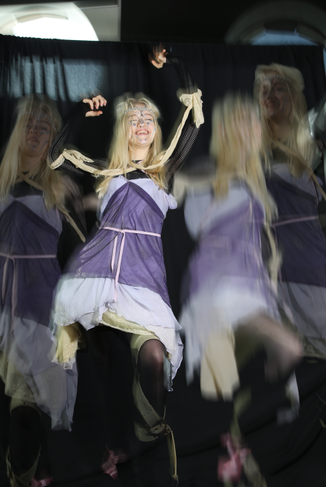
Final shoot- Production
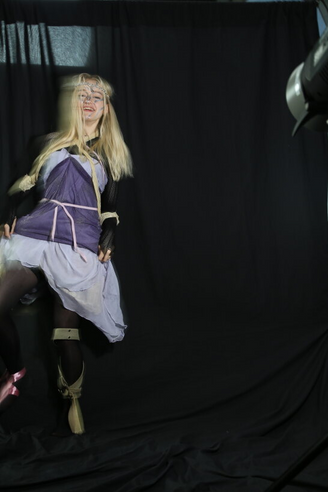
Presenting Creative Practice
Evaluation
I was happy with the the emotions conveyed by the model’s face and poses as it conveys the contentment and freedom my modern interpretation of the changeling feels.
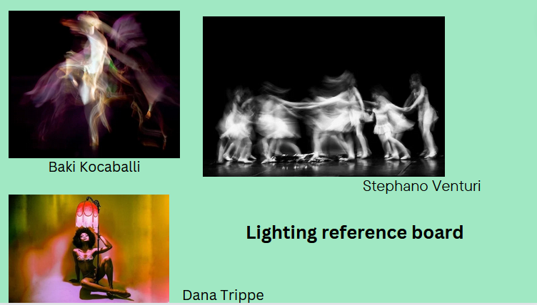
I used Photoshop to layer my photos, creating the effect of the changeling lost in dance, inspired by the photography by Harry Shunk, János Kender and Stefano Venturi. I found blending the pictures on photoshop difficult and some of the cut outs aren’t clean. I found that adding a blurring effect to certain layers created a sense of motion that I desired.
If I were to do the project again, I would change the styling to look neater and more form fitting, however Im happy with the layered and hanginging layers as they make the changeling look wild and free.
Fashion and textiles
Fashion Illustration
Context
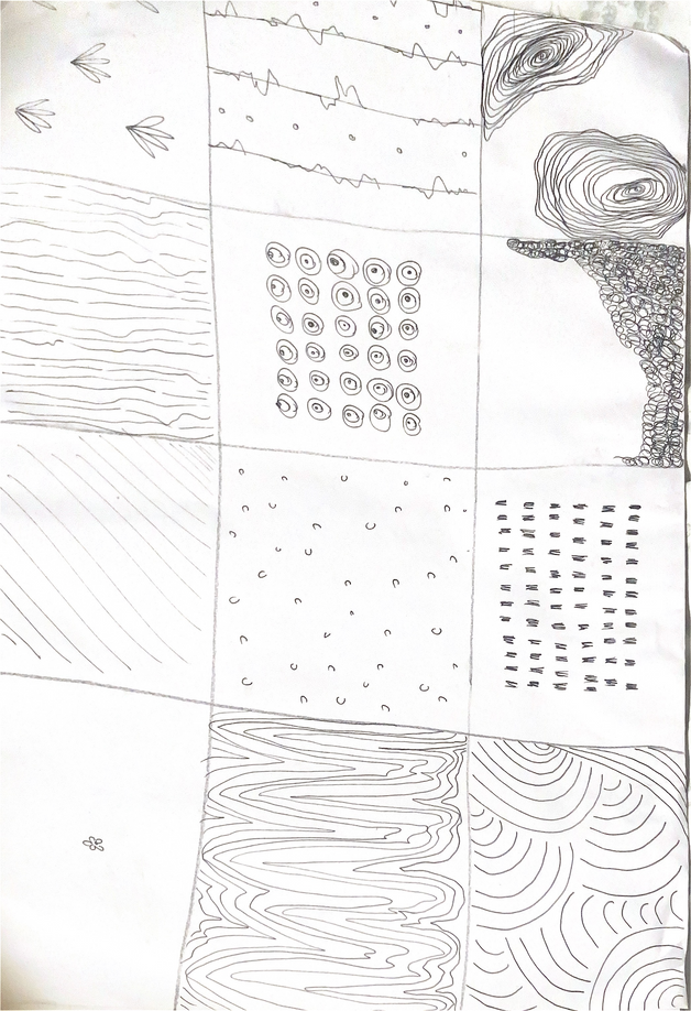
We began with 15 minutes of mark making to introduce new ideas of communicating texture and movement of the clothing.
2 min continuous line:
It was difficult to resist scribbling as an alternative to lifting the pen off the paper but I found the activity made me focus on the shape of the clothing .
2 min blind continuous line:
This activity required me to look really closely at the clothing so I could remember it which was a helpful excersise to draw accurately when drawing observationally.
3 min continuous line with 2 mediums:
I used fine liner and water coour at the same time to do a continuous line. the watercolour ran out before the drawing was finished. I liked the way the watercolour reinfororced and highlighted the shapes.
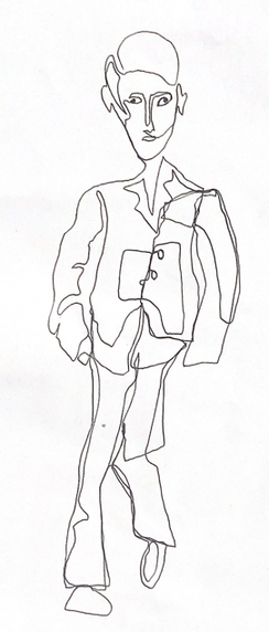
Fashion Illustration
I created two more fashion illustrations with continuous lines using photos from my camera roll. I incorporated water colour and oil pastels but to improve these I would add mark making to give the drawings more depth.
5 min exaggerated features:
We had to highlight one part of the body or clothing. I chose to exagerate the arms, again using continuous line. I began incorporating the mark making on the hat and I found this effective for highlighting this clothing.
Fashion and textiles
Development of creative practice- Draping
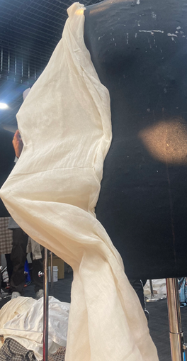
2 min draping activity to warm up:
it was exciting to discover the freedom that working on the stand gave and the way I could explore the human form.
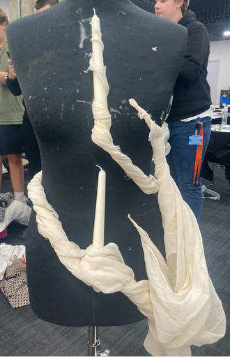
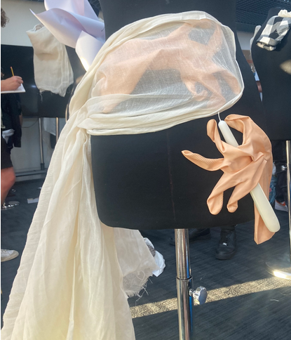
Adding household items with the prompt of ‘pull’:
I chose to use two candles, attaching them to the stand was difficult so I used the fabric to act as a bridge between the stand and the candles. to address the prompt I created folds across the stand, trying to give the illusion that the candles were being pulled across the body. I was happy with how this conveyed the concept and the dynamic shapes the fabric created.
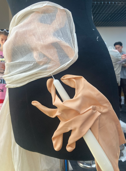
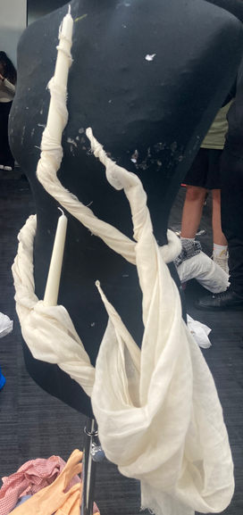
Three household items with one covered:
While I was pleased with the shapes I created with the gloves fingers, I think I could have thought of a more interesting way to incorporate the candle. I tried to use the muslin to balance out the design, leaving the fabric loose on one side.
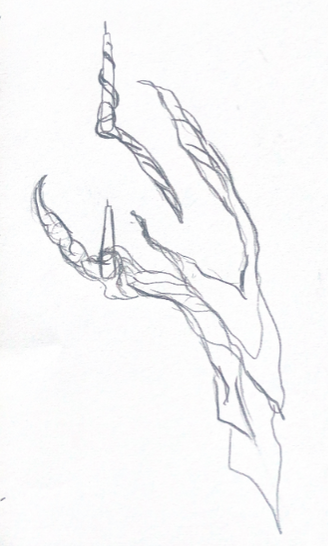
What I learnt from draping- REFLECTION
Draping on the stand really pushed me to broaden my idea of the shapes that can be created on the human body and I enjoyed how you could use the fabrics and objects to convey a story visually.
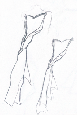
Creating a sleeve:
to create the spiked, 3D effect of the sleeves I attached candles inside the sleeve so that it held its shape. While this was effective, it couldn’t be worn practicaly.
MEDIA PRODUCTION ROTATION
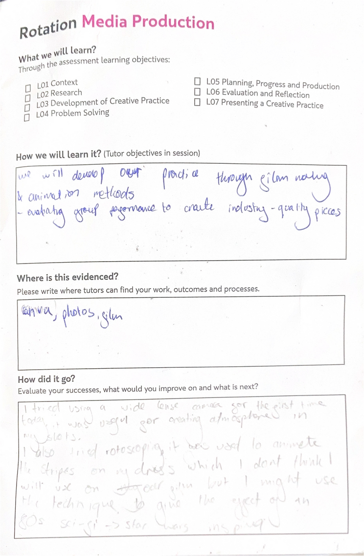
Context
The project brief was to create a short clip exploring a journey in a group, utalising the pre- production, animation and editing skills we would learn throughout the week.
06
Aims for the project:
To give our group a clear direction, we created a sentence that summed up our aim for the film that was:
Multiple stories converge to explore individual routes to the same destination.
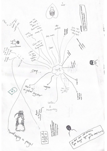
Initia ideas:
Initially, I liked the idea of capturing the journey to school, focusung on the challenges that not having an oyster cards could pose through the light-hearted expressionism of bandit masks. However, when we were given our genre this idea no longer made sense.
Getting assigned a genre
My group was assigned the genre of “sci-fi”. This helped develop our plot a lot as it prompted many ideas as it has many common themes.
As a group, we were particularly drawn to 80s sci-fi because it had strong visual themes and was recognizable.
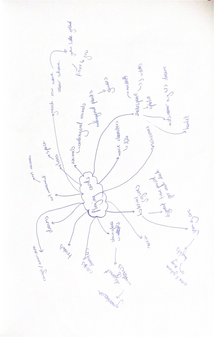
An initial group mindmap we made, exploring what “journey” meant to us and what we wanted the film to include.
Research
Research into 80s sci-fi
The 80s produced many iconic sci-fi movies such as Star Trek, Star Wars, E.T., Aliens and the Terminator. My group decided to make a trailer that had the nostalgic feel of an 80s sci-fi movie.
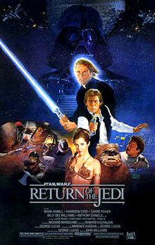
Star Wars:
As one of the most recognisable 80s sci-fi movies, I took a lot of inspiration from the Star Wars movies. In particular Return of the Jedi 1983. This film won an oscar for special effects and I used the use of rotoscoping as a source of inspiration and reference in the trailer. It was one of the first times rotoscoping had been used in live action movies and the actors were holding matte sticks which were animated over. Star Wars was also known for its special effects and sound designer Ben Burtt used a range of sources for his sounds, including projectors at cinemas.
Evaluation
The rotoscoping and sound used in the Star Wars films informed my work as it inspired me to use rotoscoping within our film. I found that using techniques used in classic 80s sci-fi movies made our genre more obvious to audiences and gave a nostalgic quality that many people feel towards sci-fi movies from the 80s.
PLANNING
Given the genre of Sci-fi, we altered our story to characters’ journey back to their space ship after it lands on Earth. This storyline allowed us to lean into the conventions of the genre more.
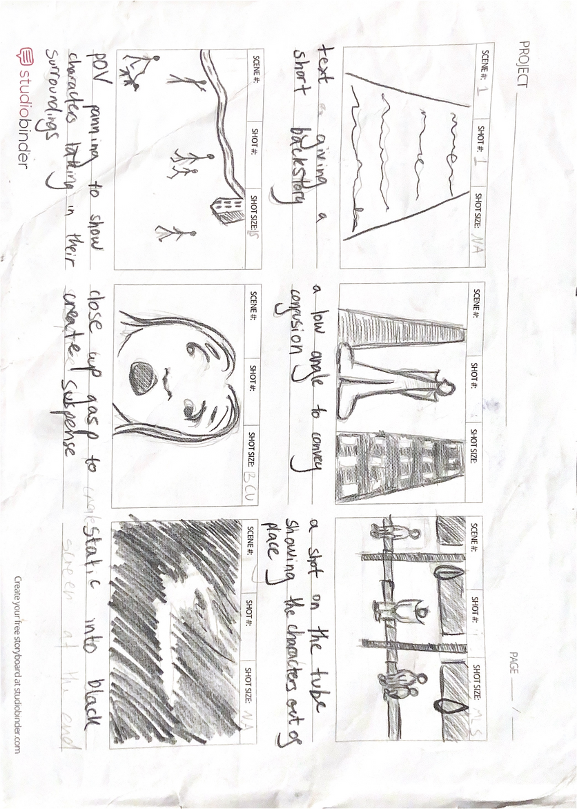
I created this story board to help me visualise some of the shots I wanted to be included in the trailer. I found this useful for communicating my ideas to my group and the story board was useful to reference when we were filming, to keep us on track of what we wanted to capture.
Test shots- Film making tests
This angle was one I wanted to create for one of the first shots to introduce the character. It depicts the character taking in their new surroundings. I chose this low angle as I felt that it conveyed the confused and out of place emotions the character would be feeling.
Doing these test shots was useful because I discovered that it was difficult to fit the entire body in from this angle while filming landscape, so when filming I knew I needed to go from a very low angle.
Creative development
I took test shots to experiment with the angles I wanted to capture when filming, using the shots I had planned in my storyboard.
When fiming for the final movie, this shot required me to lie on the floor to fit her whole body in frame
Reflection:
When doing the actual filming on location we found it wasnt possible to get the exact set up we wanted because of other people on the tube.
Here I was testing an extreme close up shot. This shot was effective at showing a characters’ emotions and has the dramatic effect that a trailer needs.
Research
Final outcome
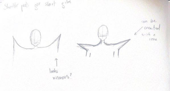
to create the the shoulder pads I used paper and created angled cones. I did specific colours for each character to help give them identity and distinguish them from eachother, taking inspiration from another 80s sci-fi: Power rangers.
Problem Solving
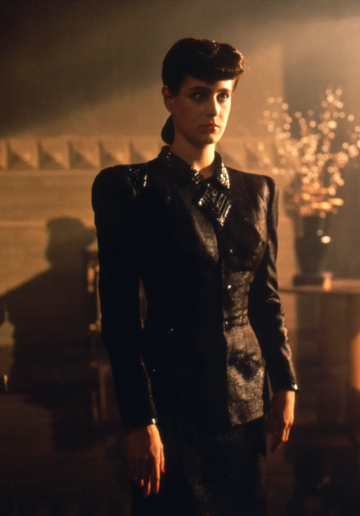
Sean Young costumes for Blade Runner 1982
Blade runner is an example of a sci-fi movie from the 80s and I took inspiration from the costumes. In particular the suit worn by the character of Rachel. The film and its costumes aimed for a Film Noir feel but the 80s silloettes, especially the shoulder pads heavily places it within the 80s. Sean Young employed futurism in the designs which is partly why I thought it would be a good fit for our sci-fi film.
I referenced the shoulder pads of Rachel’s power suit, using them to further emphasise the genre and time period we were recreating.
My first design for the shoulder pads were heavily 80s inspired and harsh, and while this looked dramatic, it looked villanous instead of sci-fi. To fix this I made another design where the points of the shoulder pads were more angled outwards which successfully looked more sci-fi whilst still referencing the 80s.
Research
District 9
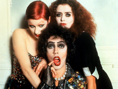
The Rocky Horror Picture Show
Originally, our group was considering a Doc-Mockumentary style for the film, inspired by the 2009 sci-fi District 9. We thought this style would suit the light hearted nature of our film but in the end we decided against it becuase itbecame confusing when mixed with the trailer format.
While it slightly strays from the theme of sci-fi specifically from the 80s, we took great inspiration from the Rocky Horror Picture Show in a number of areas in our film. Initially, this inspiration came from the costunes and their stricking, over the top nature. We also took inspirations from the props in the film as they had the same unrealistic style that indicated the time period that they were made in.
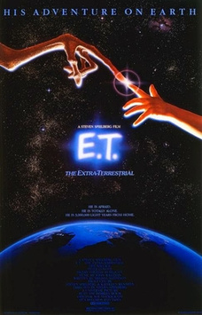
E.T.
E.T. was one of the most successful and recognisable sci- fi movies of the 80s, released 1982. It broke conventions of other science fiction movies of the time because it had a more playful tone, presenting the alien as friendly instead of menacing. This was a source of inspiration for our film as we tried to have a similar, harmless attitude towards the aliens of our film.
CREATIVE PRACTICE DEVELOPMENT
Rotoscoping
We learnt how use rotoscoping on photoshop to add animation to our films. It was a new method for me but I thought it would be well suited to our movie because part of the nostalgic aspect of 80s sci-fi movies is the unrealistic special effects.
First attempt
To create the laser for the gun I drew a dot first moving across the screen and added the line of the laser afterwards. While this was useful for creating the path for the laser, it created an unnatural movement for the laser. The path that the laser took also looks unnatural because I angled it upwards but the angle of the gun suggests that the laser should shoot downwards. I also missed some of the frames when rotoscoping, the result of this was that the laser is patchy.
Development
To improve from my first attempt I created a downwards path for the laser. This looked a lot more natural. I also was more thourough with checking that I hadn’t missed any frames so the laser moved across the screen much more smoothly. Instead of creating the path with a dot first, I did a line shape the entir time and I was pleased with how this came out because it looked more realistic. To improve this I would slow the laser down so that it can be seen more clearly.
Creative practice Development
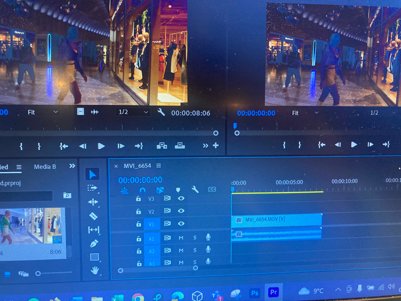
Learning to use Premier Pro
We did a workshop to learn the basic skills on Premier Pro in order to have the skills to begin post-production of our group movie. I learnt how to import clips into premiere Pro and create a timeline sequence with multiple clips.
Problem solving
I chose to combine two of the clips I had filmed because they followed the journey of one character. This involved me cutting the clips to an appropriate length for a trailer. While I liked the two clips together but I didn’t like the harsh transition between them. To solve this, I added a fadeing transition so they merged together more naturally.
Reflection
I found this workshop challenging because I was unfamiliar with the software but enjoyed the process of combining clips together. In the future I would like to work on incorporating sound.
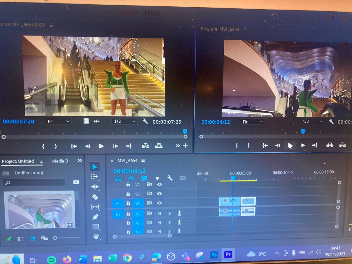
My two clips edited together:
EVALUATION
What went well?
What could be Improved?
What have I learnt?
I think that our trailer successfully draws on conventions of the 80s sci-f genre through costume and editing. I am pleased with the progress I made with rotoscoping on photoshop and getting to grips with using premire pro. I am happy with how the shots I planned and shot went as they conveyed the emotions and story in the ways that I wanted. I was particularly pleased with the low angle wide shot because I altered my original idea to have the actress running into the frame and this added moment of action makes the trailer more dramatic. Also, the location we found for this shot matched my idea very well, with the tall surrounding buildings making the alien look more out of place and intimidated.
Next time, I think it would be interesting to experiment with creating a script. This wasn’t fully nesscisary when making a trailer, but it could have added more clarity to the story. As well as this, we could have drawn more on thr concept of “journey” as it got lost slightly s we tried to honour the genre we were given. With the shoulder pads, I think I could have improved the material I made them with as the paper was prone to loosing its shape. I also could have thought of a better way to connect it to the shouder as they sometimes slipped off. I found premier pro challenging and next time I would like to work on using more advanced editing techniques. I also think my rotoscoping could have been smoother and I could have added more of it into the rest of the trailer.
From the media poduction rotation, I have learnt about how important planning is when creating a short film, in particular, how important it is to create a clear vision within your group. I also learnt about the benefits of creating a story board and will definitely be using these in the future becasue they really helped to communicte my ideas to my group. I have also learnt new skills with rotoscoping and premiere pro which I am keen to continue to develop. This project taught me how much costume can help communicte a genre or time period as well.
3D DESIGN ROTATION
context
Project Brief
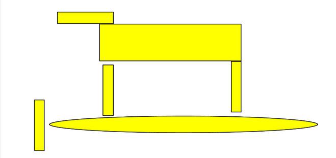
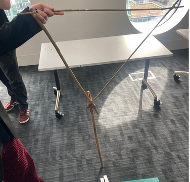
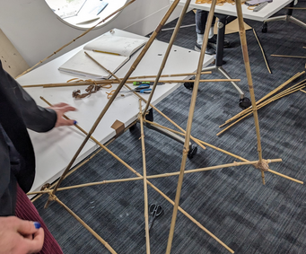
We were tasked with creating a bridge between two tables that could carry an electric car over it nd have a “boat” pass under it.
Primary Research
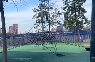
This was an exampe of a tensile structure, we ended up using this as inspiration on our bridge, using elastics to make the string.
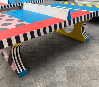
I looked around the local area to find spanning structures as inspiration for the bridge. I ussed this ping pong table as a source of inspiration because the sturdy legs of it worked as a very solid support for the top of it.
From seeing this spanning structure I realised that being lower to the floor can make the structure for stable. However, this wouldn’t work for our bridge as it had to be tall enough for the boat to pass under.
Planning
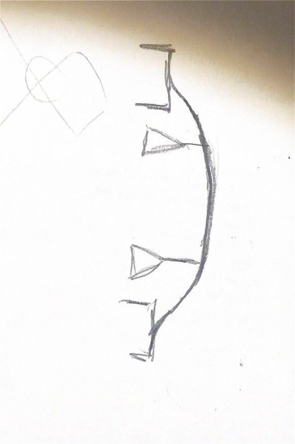
This was my initial sketch of my ideas for the base of the bridge. I thought that a triangle base would be suitable base as it is a very strong shape
Problem solving
After creating the shape in my initial plan, I found it wasnt the strongest base and we decided to attatch the bridge more securley to the table so that we could have only one point of contact with the floor in the middle of the bridge.
Inital sketches done by other group members that we refernced:
Creative development
We found that this structure gave a stable connection to the table, however it was horizontal so didn’t add a lot of height to the bridge. I developed skills in construction
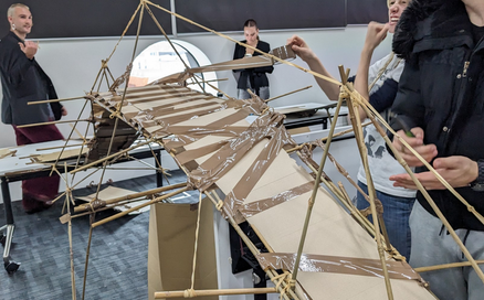
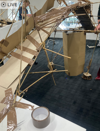
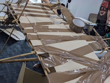
Final outcome:
Evaluation
A picture demonstrating the excess of tape:
Overall the project was a success because the car could travel across it both ways wihout faalling off and the boat could pass under it. However, the car did not run across the bridge smoothly and had to be readjusted a few times.
To improve the bridge I would definately remove the excess tape from the base of it as the car got stuck on this. As well as this, I would make the bridge smoother and straighter with a less steep incline. I think that the aestetics of the bridge could be more carefully considered as well because as a group, we focused mostly on the practicality and some attention to the aestetics could have added to the design.
I am pleased with how stable the bridge was and this can mainly be attributed to the secure connections to the table that we created. The bridge also achieved a good height, even though this required a overly steep incline. Next time I would make the pillars in the middle of the bridge thicker as they were slightly unstable.
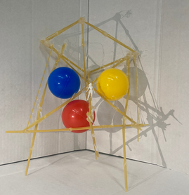
Context-Project brief
We were tasked with creating a structure out of spagetti that could hold 3 balls without them touching. The task aimed to get us to experiment with different structures, thinking about balance and scale.
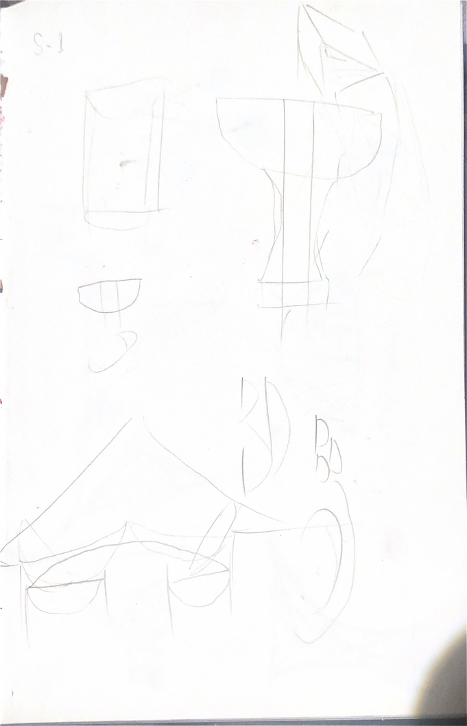
Planning
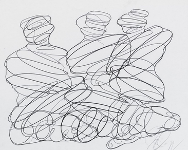
I began by making quick sketches of initial ideas for structures to hold the balls. This was useful but it was difficult to visualise how some of my designs would translate to 3D so I found that many of these sketches weren’t suitable.
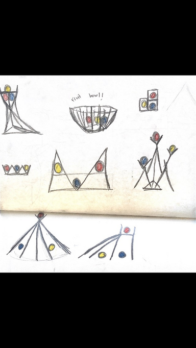
I also did few exercises using continuous line with my eyes closed or only looking at the subject and then placing the balls within the drawings. I found that these excersises were effective at loosening up my drawings and getting me to really focus on the subject I was drawing.
Problem solving
I had to make the supports on the sides of the structure narrower and thicker because when there was only one strand of spagetti the balls would snap it, and when the sides were too wide they couldn’t provide the resistance needed to hold the balls in place.
Presenting creative practice: Final outcome:
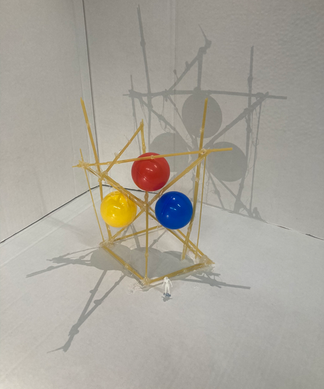
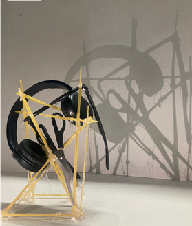
When photographing my structure I included aspects of scale used in architecture by adding human models to give a sense of how large it would be in reality. I also experimented with shadows by suing to light sources to create two shadows in order to make the photos more dynamic. I also added hpousehold objects into the structure to further experiment with scale and also to test how sturdy my structure was. This allowed me to experiment with different ways my stucture could hold items, this time using more balance than resistance.
Looking at photography and scale
I didn’t end up sticking exactly to any of my original designs and instead did a mix of many of them as well as adding spagetti where it felt needed. I used a wide base to support the rest of the structure. To hold the balls I created one basket-like structure at the top and two sections on either side that were small enough to trap the balls.
Creative development
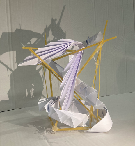
Testing the strength of my design
After we completed the structures we wanted to test their strength and in order to do this we created paper structures to strengthen it then threw a basket ball at it to see if it would withstand. I created crinkled paper structures because when they fanned out they filled the gaps in my structure. I liked how this looked visually but when it was tested with the basketball it didn’t stop the structure from being crushed. To improve this I think I should have added a higher volume of paper.
Evaluation
Overall, the project was a succes becuase my stucture hed all 3 of the balls separately. However I feel as though the structure could have been more stable if I had added thicker strips of spagetti. I also would have like the structure to be able to stand on its own upside down, without leaning against something because this would make its uses more versitile. I am very pleased with how the photographs of the strucure came out, my use of shadow in particular because I think they showcase the dimensions of the structure well. I learnt a lot about how to convey scale by doing this project and I will definately be using the technique of the models of people in the future.
Context
Project brief
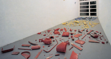
We had to list gifts we’ve recieved throughout our lives to then display in a visual way.
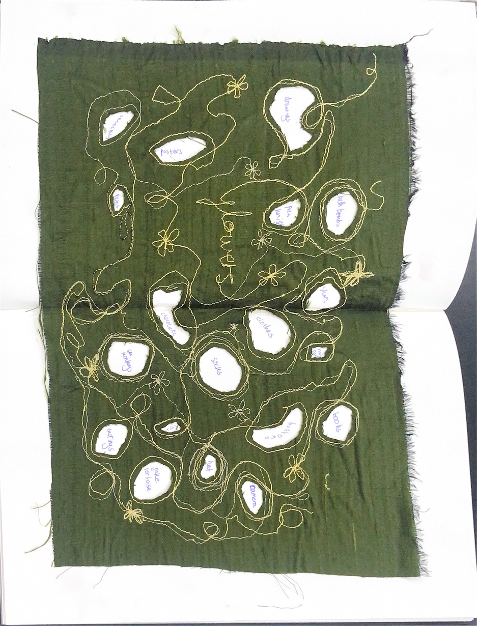
I chose to display my list of gifts I’ve revieved through embroidery. I began with “flowers” because it’s my personal favourite gift to recive and used a sewing machine to write this out and create a pattern around this. I then cut out holes from the pattern I’d created and used these as spaces to write other gifts I’d recieved.
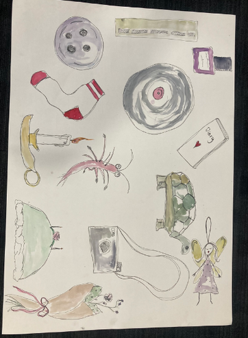
I then drew out the gifts, using watercolour to help to make them stand out individually.
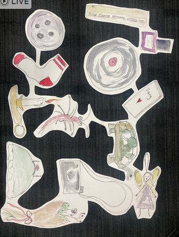
I cut out the shapes, keeping parts connected. If I could do this stage again I would cut the shapes out in More of a continuous pattern as the shape I created limited the shapes I could create with the paper afterwards.
Research
Primary research
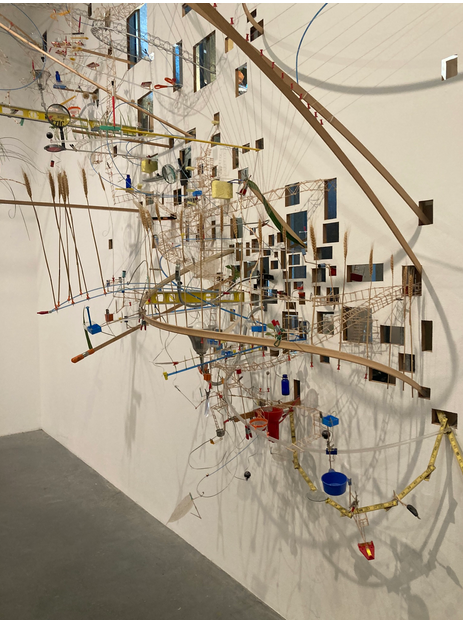
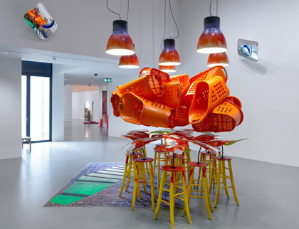
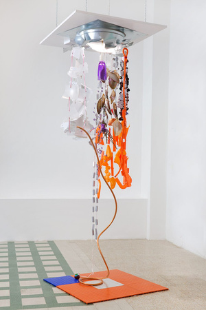
At the Tate Modern, I was inspired by the way Sarah Sze created chaotic structures with household items and used this as a source of inspiration for the shapes I tried to create with my own drawings of household items I had recived as gifts.
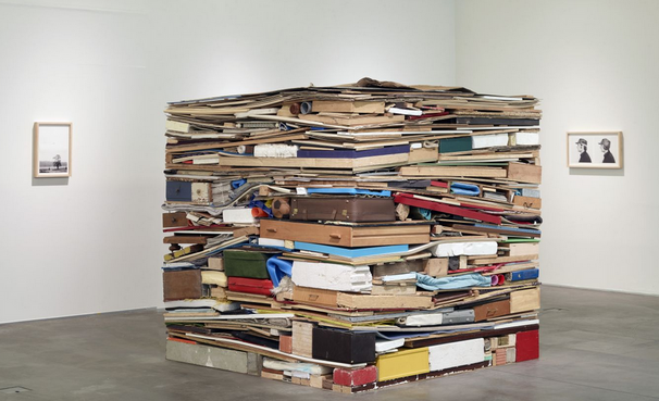
Tony Cragg
Tony Cragg is a German sculptorwho looks at objects in the material world whn creating his pieces. I was inspired by the way he combines everyday objects to create a new form while still displaying the individual objects. His sketches also reminded me of the closed-eyed drawings I did before making my 3 ball project.
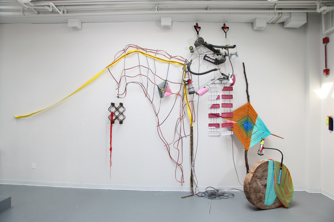
Jessica Stockholder is a fine artist who combines mediums like paint and sculpture to create installations. Her work explores abstract expressionism and utalises everyday furnature and objects i unconventional ways. I was inspired by the way she displayed her items, with many looking like they were cascading downwards and I tried to emulate this when displaying my drawings of everyday objects.
Research
Jessica Stockholder
Richard Wentworth
Richard Wentworth is another artist that uses evey day objects in his work, aimining to create unconventional situations or locations with his sculpture and photography. His use of every day objects in places and positions we wouldn’t expect has an uncanny effect. I was drawn to his unusual use of space and how this gives an interesting role to seemingy uninteresting items.
Presenting Creative Practice and Reflection
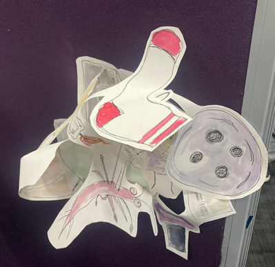
With the new shape I had created, I used pins to fold and secure the drawings. I was pleased with how this turned out because the viewer could see a different range of objects depending on what angle they looked from.
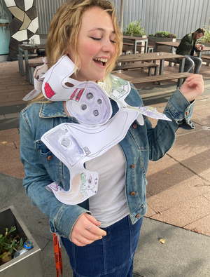
Here I wrapped the shape around a person, this worked as an effective way to display all of the different drawings at once but I think I could have molded the paper to the human form in a more dynamic way.
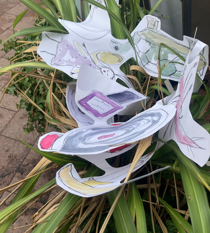
I also tried to incorporated the shape into plants. However I was not happy with this result because the plant and the paper didn’t interlink very well and I think it would have looked better if I’d used stiffer plants, tree branches for example.
VCD ROTATION
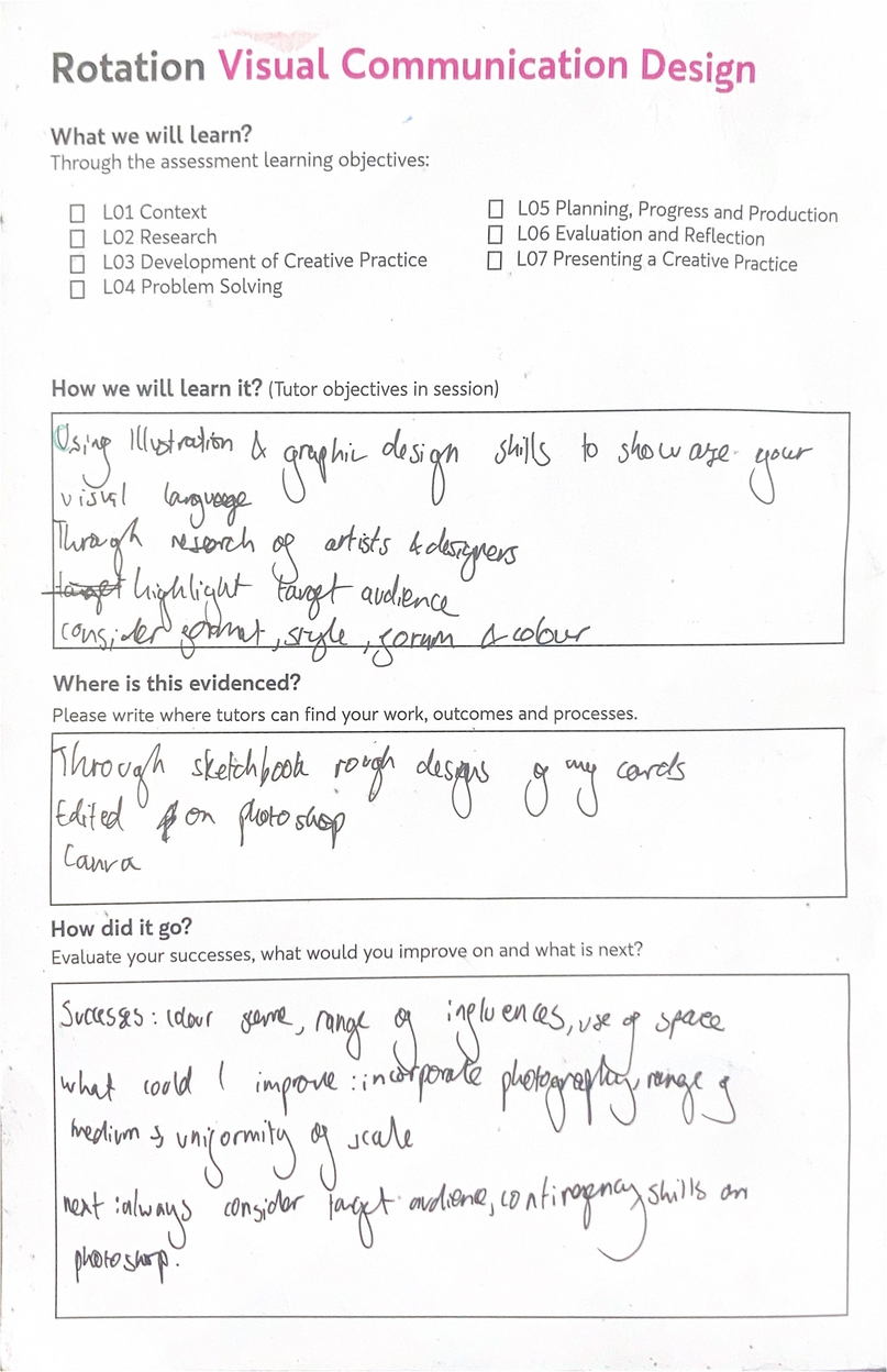
Context
Project Brief
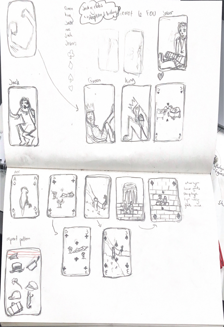
I had the choice to design either a deck of playing cards or a deck of tarot cards as well as their packaging. The project aimed to push my skills in illustration and design as well as get me to plan a set of designs that worked together with common themes.
I began by brainstorming ideas for cards based on the characters and scenes in the film. I wanted the cards to follow the two main characters, expressing their journey throughout the film. I found it useful to think about my target audience and I decided this was most likely young adults who know the movie well and would appriciate some more subtle references to imagry and costumes in the film.
Planning
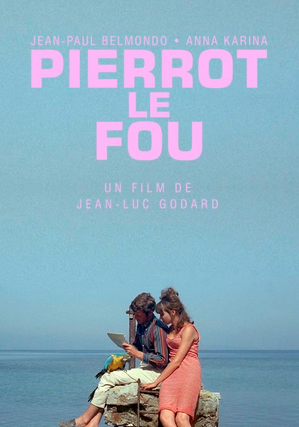
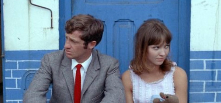
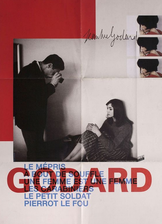
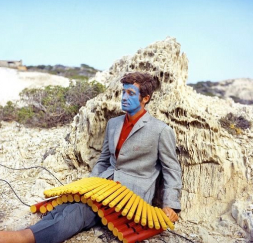
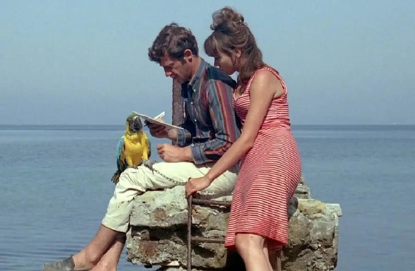
I chose to make playing cards based on the movie Pierrot Le Fou. I chose this movie because of its stong visuals and strict colour schemes which I though would translate well into playing cards because these are also quite structured.
Research
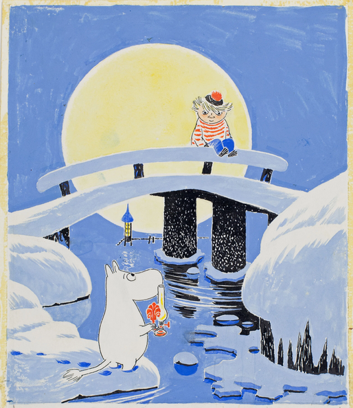
Tove Jansson
The illustrator for the Moomin childrens books.
Illustrators
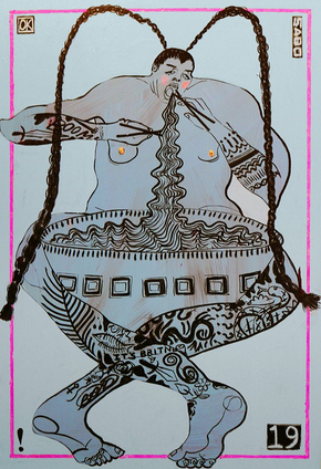
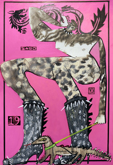
Kevin Sabo
Kevin Sabo’s Choose your Fighter series is an exploration into fasion and character, as well as a way for the illustrator to use pop culture and gaming culture to explore identities that are a mix of masculine and feminine. His work reflects lots of the csexual and gender based contradictions of his own identity throughout his life through light hearted and expressive characters. I was very struck with his bold use of space and how his characters seemingly burst out of the frame. His composition also reminde me of a playing card so I wanted to emulate his unconventional use of space.
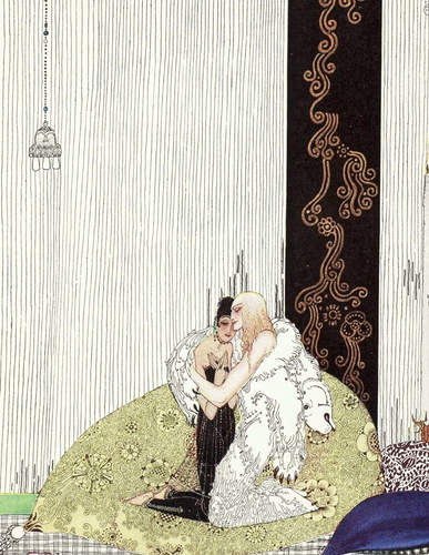
kay neilsen
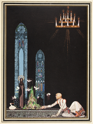
I was inspired by the compositions of Kay Neilsen’s illustrations and how they use a lack of symmetry to draw the eye
Graphic designers
Sotolongo & Carole Goodman
Their bold and eye catching graphics were inspiring to me because of the block colours that reminded me of french new wave cinema posters
CentreCentre
Influenced movie poster design
Pep Carrió
Pep Carrio is a graphic designer but I was more drawn to his visual diary that he posts daily to his instagram. I was inspired by the use of space in these diary entries and how eye catching their use of negitive space makes them.
Type designers
Mother design
Sanchit Sawaria takes inspiration for his types from unconventional places like philosophers and enjoys creating his own lettering, making commissons for many places including the New York Times. His style reminded me of old movie posters which is why I was drawn to it, as I thought it would link to my movie-themed cards. I am also inspired by his use of bold block colours.
Sanchit Sawaria
Product designers
Studio Tempo
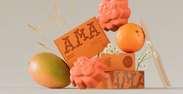
The creators of the Ama bath soap bar wanted to create a product and packaging with children as the target audience. They aimed for a simplistic but fun design that was visually appealing. They achieved this through their use of colour sceme which I took inspiration from.
Saul Steinberg
I was inspired by the hand drawn aspect of Saul Steinberg’s work and wanted to include a hand drawn aspect in my cards.
Moodboard
Progress
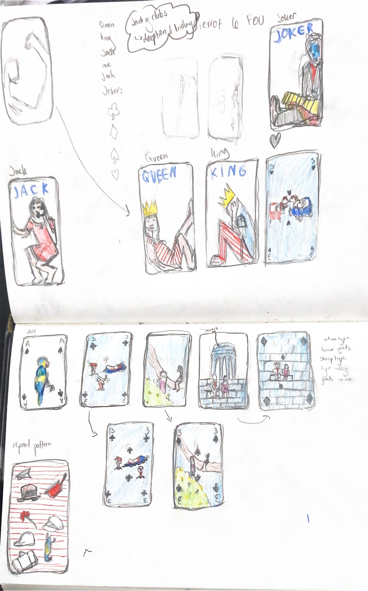
My card designs follow the same colour sceme as the film: prodominantly read, white and blue with some yellow and pink.
With the character cards (king, queen, ect) I wanted a simplistic design that explored negitive space and went to the borders of the cards to look unconventional in a similar way to the directorial style in the film.
I wanted the numbered cards to ustalise scenes from the film with a layout that differed from the character cards.
These were the scenes I based my cards on
I altered the layout of my original idea for this card becuase it made it more cohesive with the rest of the deck.
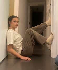
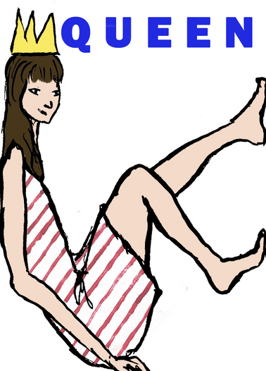
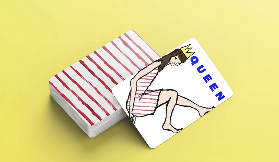
Designing my QUEEN card
I was originally interested in the idea of a person sitting within the card frame and decided to use this for the queen card because the confidence and comfort of the pose matched the personality of the charcter that I was using to depict the queen.
Final queen design
Problem solving
I realised that the reference photo I took for my first two designs was taken in a wider space than a playing card which was why the proportions looked off. I took a new reference photo in a doorway and this gave me a much better idea of the position of the legs on the card.
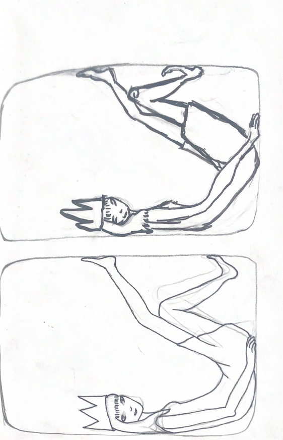
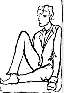
This was the drawing I originally made from my first reference photo. I found taking a reference photo useful for getting the proportions right. I didnt’ like the drawing style of this card and wanted it to look looser.
I used ink instead of fineliner fo this design to achieve a looser and less realistic drawing. I was much happier with the result the ink gave me but I still wasn’t satisfied with the design’s poportions.
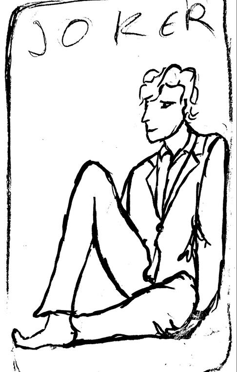
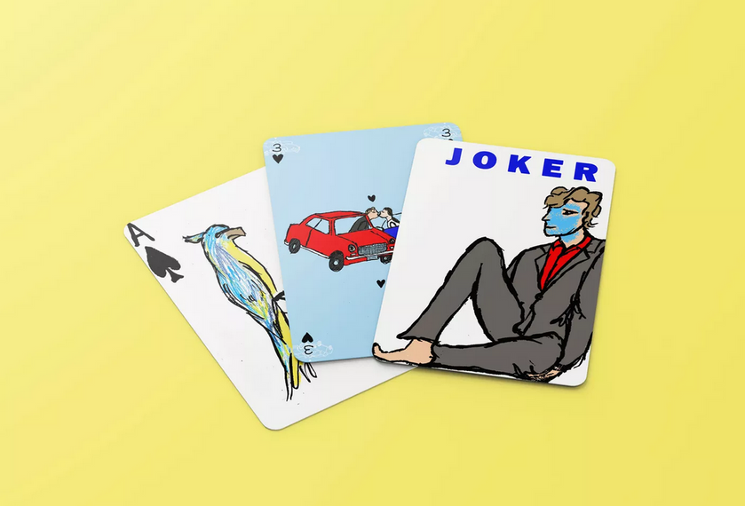
Designing my JOKER card
Creative development
After fixing my design so that it fit into the card, I scanned it on my phone and switched the settings to black and white to make the lines bolder. I then used photoshop to add colour.
I left out the yellow dinimite in the movie as it wasnt clear what it was and the design wascleaner without it.
I was inspired by Kevin Sabo’s use of space
Final card design
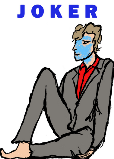
I had to change my original design because the hand was too low which ruined the illusion that he was sitting in the card.
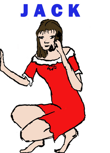
Designing my JACK card
I decided to use this character for the Jack card because certain Jack cards have connotations of deception and trickery which mirrors the personality of this character very well, and with the target audience of fans of the film in mind, this choice would be nderstood by them.
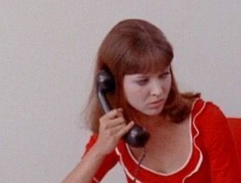
I loosely recreated the bold dress the character wears, not sticking perfectly to the design as I wanted to simplify it slightly to be more impactful.
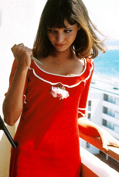
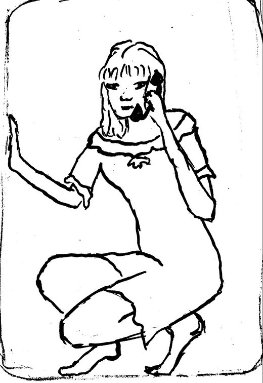
Reference photo that helped me figure out proportions:
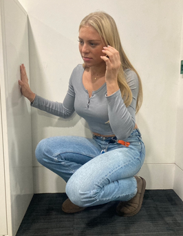
Final card design
Reflection
In retrospect, I think the design would have been ore impactful if I had highlighted the telophone more. It blends in slightly with the dark hair. To improve this I could have made it white or another colour from the colour scheme like light blue or yellow.
Designing my KING card
I wanted to slightly subvert the steryotypes associated with the king card to match the character in the movie. His character expectaions are subverted when he discovers he has been tricked all along and I thought it would be interesing to show his emotional turmoil on this card, contrasting the steryotypes of strength and power of a king.
Final card design
Choosing my typography
Reflection
I am very happy with the pose and style of the drawing, however the stripes on the trousers, while they match the dress of the queen, look slightly out of place and could have been replaced with a block colour.
I was inspired by movie posters by the same director as Pierrot le Fou, John Luc Goddard and I wanted the text to reflect the style of french new wave movies. This led me to choose a bold font that stood out from the illustrations.
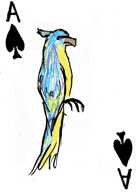
Designing my ACE OF SPADES card
I like how the ace of spades cards always stand ou from the rest of the deck so for my deck I wanted the design of the card to be slightly different from the other cards but still refference the film. I wanted it to be a symbol in the film that fans of the movie would recognise and appriciate. This led me to choose the blue and yellow parrot that appears in one of the scenes. I liked how it could still fit the coulour sceme of the cards while standing out from them.
I ended up adding some yellow with the brush tool on photoshop over the top of the hand drawn colours in order to have an exact colour match with the yellow on the other cards to tie this ace card in with the rest of the deck.
Reflection I am very pleased with the result of this card because I think it succesfully stands out from the other cards. I am also happy with how the layering of the dark outline in photoshop went, as it was difficult to line it up. To improve the card I could have tried to make the parrot interact with the frame of the card in a similar way to my king and queen ect.
Final card design
Designing my cards for the rest of the deck
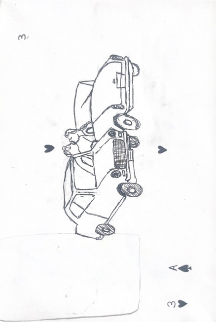
I decided to have only one design for the rest of the deck so that it looked more uniform and so my character cards stood out more. I chose this design because it was one of the most well known images fro the film and incorporated the main colours (red, white and blue) from the colour scheme.
Final card design
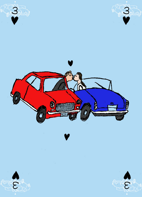
Reflection
I like the bold colours in this design and the simplicity of the design, however to improve it I think I could have added some hand done colours or patterns to even it out.
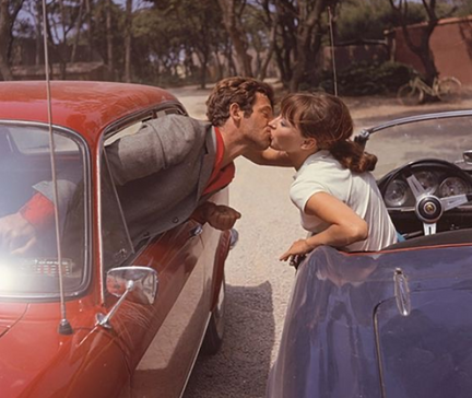
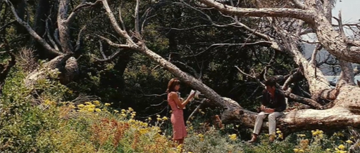
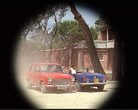
The shot I used as a refence for the position of the cars:
Research
Creative Practice Development
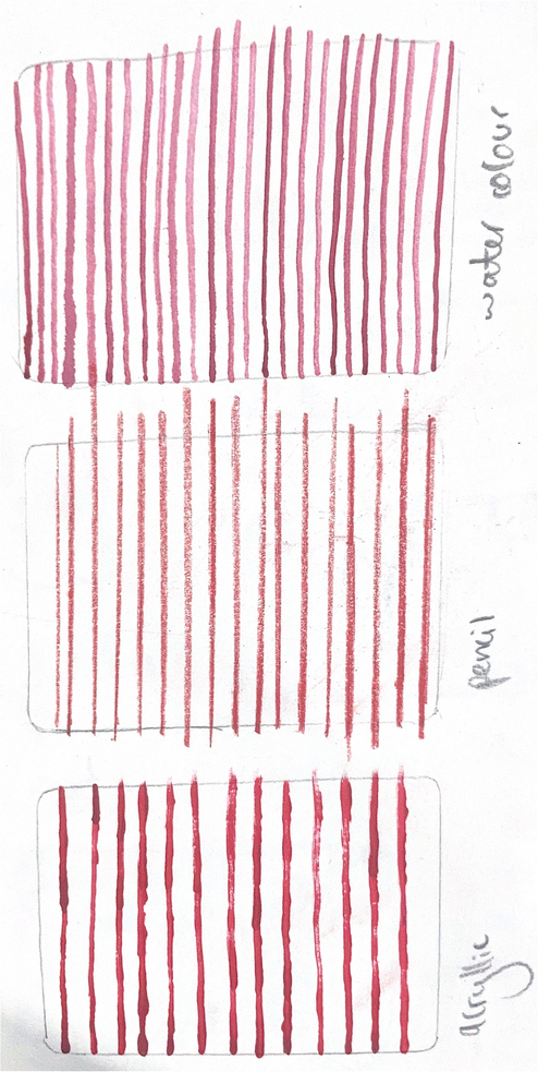
I decided to use a similar technique to Lauren Child to create the stiped dress Anna Karina’s character wears in th movie on my queen card. I wanted the patterns t be hand drawn to contrast with the block colours in the rest of the cards. I created the stripes with acrylic paint, pencil and watercolour to see whuich medium would be most appropriate. I chos ethe acrylic because I liked the messier effect it created.
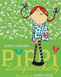
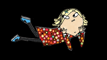
Lauren Child
Lauren Child is an illistrator for childrens books such as Pippi Longstocking, Hubert Horatio and most well known for Charlie and Lola. I was drawn to her work because of the striking way she uses patterns in her work. In particular, how these patterns are inserted into illustrations imperfectly and don’t attempt to look natural.
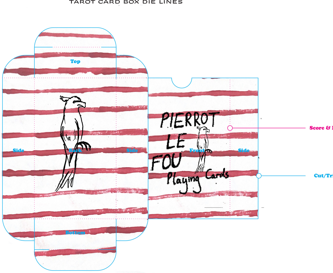
Design for the box
I wanted the box design to link to the deck but be very simplistic. I thought that the image of the parot was subtle and a overused image within the film but linked well to the rest of the cards.
Presenting Creative Practice
For the back of the cards I decided to put the same stripes used on the king and queen in order to further tie all the cards together.
Evaluation
What went well?
What could be Improved?
What have I learnt?
Overall I am very pleased with how my pack of cards turned out because I think I achieved a good balance of conrasting and complimenting designs. I think I achieved this through colour sceme partly and using the exact same colours on photoshop throughout the cards helped to do this. I really like the used of the frame on the character cards and how the use of negitive space is striking. I am pleased with how the cards reference the movie in a way that will be recognisable to fans of the film.
To improve the card deck I think I could have incorporated some aspect of photography into the cards in a similar way that added the handpainted stripes to the dress. I think this could have made the cards more dynamic as some of them, especially the regular deck cards looked a bit flat as a result of onl using block colours with the brush tool on photoshop. I also could improve the uniformity of the scale of my drawings as the Queen is larger than the other character cards and doesn’t have as much negitive space as I wanted.
From doing this project I have learnt about the importance of thinking about your target audience and how you want them to react to a product. I have also learnt about creating desgns with an overall theme and contingency and how having a common theme throught a deck can be more visually appealing. I have improved my skills with photoshop and am proud of the new techniques I have learnt, in particular scanning in my drawings and editing them to be a bold outline as I think this is a skill I will continue to find useful to elevate some of my hand drawn work.
3D specialism skills week
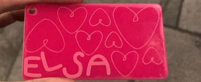
Laser cutting
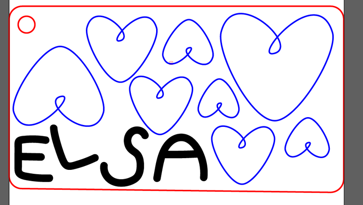
We were tsked with designing a keyring on Illustrator to then be engraved and cut out by a laser cutter. This required new skills for me on Illustrator like free drawing and learning about the exact required levels on colours in order for them to be recognised by the laser cutter. We had to colour code our design with blue, red and black according to what we wanted engraved, cut out and etched in. At first I made the mistake of selecting a random shade of red and blue instead of setting the levels to be pure blue and red, this would have led to the laser cutter not recognising them and not carring out my design.
Evaluation
I found this project challenging because of my limited experience on Illustrator but I am pleased with the new skills I gained from carrying out the project. My key ring came out very clearly and I am pleased with the places I chose to engrave and etch. If I were to do the project again I would use the new skills I have learnt on Illustrator to push myself to do a more complicated and intricate design, possibly taking the shape of the keyring more into account.
3D Fabrication
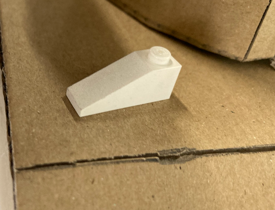
Project Brief
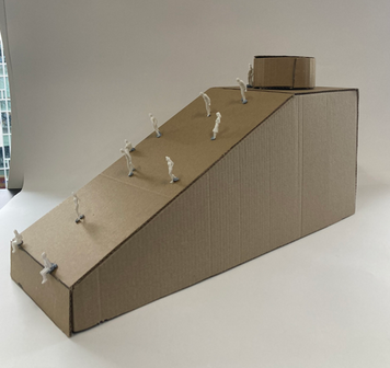
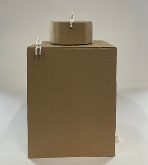
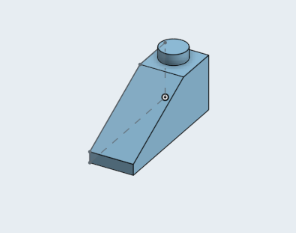
We were each tasked with recreating a single lego piece, utalising scale and construction.
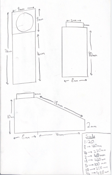
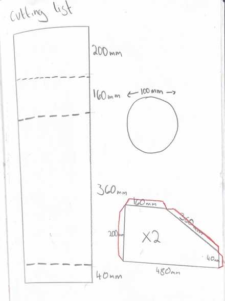
Planning
I began by taking measurements of my lego piece and increasing the scale 1:20. I decided on this scale because it would allow me to constuct the piece with more ease as it would be larger. I then made a cutting list of pieces, deciding to do the one long piece for the top, back and front and using scoring to make the bends. For the side pieces, I added tabs to connect them
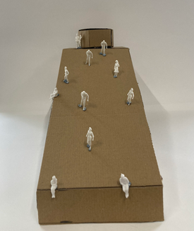
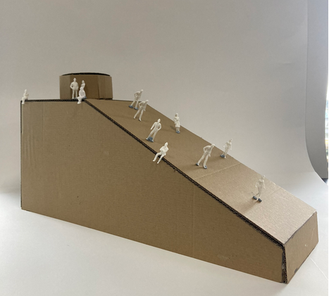
Final Outcome
Problem Solving
I forgot to put a tab on one of my side pieces so to connect it to the rest of the structure I created a strip that I scorred down the moddle and connected to both pieces. This was very effective at connecting the two parts.
Evaluation
Overall, I am pleased with the outcome of this project asI scuccessfully recreated the pIece to a larger scale. To improve I would ensure that I drew one of the side pieces in reverse to the other so that the same colour cardboard was used on all sides. I would also make the citcle on the top smoother by adding some scoring to it as it was quite jagged.
Development of creative practice- Digital Fabrication
I created a second shape to make use of the revolve tool. I struggled with creating a shape that was suitable for the program to revolve and needed to simplify my original design. To improve this I would add more bends in my design to see what shapes I could successfully make.
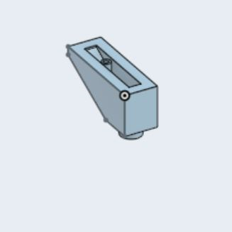
Using OnShape, I digitally recreated the lego piece I had made with cardboard. This was my first time using OnShape and I found it very challenging to controll all the faces. This taught me how to extrude shapes and create shells. To improve my shape I would ensure that my circe was in the centre of the top face as it was slightly off.
CONTEXTUAL STUDIES
Observational drawings I did at the Tate Modern:
What does Democracy, Protest and Empowerment mean to you?
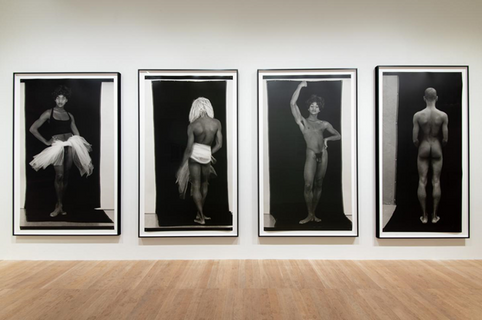
To me, Democracy, Protest and Empowerment means the ability and act of expressing your identity. Constructs is a series of photographs by Lyle Ashton Harris in 1989 that explores his identity through race and sexuality. His poses and the tulle fabric are reminiscent of a ballet dancer which challenges the expectations of masculinity. This paired with his nudity and context of being amid the AIDs epidemic, gives the photographs an element of protest against the views and animosity towards queer people at the time. The prints are life sized and this scale makes the photos imposing and hard to ignore. This scale, especially with the strong eye contact held in Construct #10, convey how Harris wasn’t ashamed of his identity and didn’t try to hide who he was. In his own words the series is “a social critique of notions of passing and notions of beauty. Clearly, I’m not trying to pass.” He wears whiteface in one of the photos which acts as a form of protest against the society he was inhabiting by highlighting racial injustices. His choice to make the series self-portraits reinforces the idea of embracing your own identity. With simply four self-portrait photographs, Lyle Ashton Harris exercises his freedom of expression, using this expression to empower himself and other people who find themselves marginalised for their race and sexuality. I found how he uses his unapologetic depiction of himself as a silent form of protest against expectations to hide your true identity impactful and striking.
Authenticity Statement
“I confirm that the published work for the Unit 1 assessment of my UAL(Awarding Body) Foundation Diploma is all my own work and does not include any work completed by anyone other than myself (accept where credited) and sources have been appropriately referenced. (SKYLA ROGERS, 04/11/23) “
Bibliography
Bedard, M. (2020). Rotoscoping: The Perfect Marriage of Live-Action with Animation. [online] StudioBinder. Available at: https://www.studiobinder.com/blog/what-is-rotoscope-animation-definition/ [Accessed 10 Oct. 2023].
Duong, H. (2018). Photographers Who Captured the Ecstasy and Abandon of Rave Culture. [online] Artsy. Available at: https://www.artsy.net/article/artsy-editorial-photographers-captured-ecstasy-abandon-rave-culture [Accessed 3 Oct. 2023].
Durón, M. and Durón, M. (2019). Out Side In: In His Arresting Work, Lyle Ashton Harris Looks to the Recent Past for New Ways Forward. [online] ARTnews.com. Available at: https://www.artnews.com/art-news/artists/lyle-ashton-harris-12262/ [Accessed 30 Oct. 2023].
Geier, T. (2022). Best Special Effects in ’80s Sci-Fi Movies, Ranked. [online] MovieWeb. Available at: https://movieweb.com/scifi-80s-special-effects/#star-wars-episode-vi---return-of-the-jedi-1983 [Accessed 15 Oct. 2023].
Gorny, L. (2023a). Mother Design rebrands dedicated foundation supporting Brooklyn’s non-profits. [online] www.itsnicethat.com. Available at: https://www.itsnicethat.com/news/mother-design-brooklyn-org-graphic-design-131023 [Accessed 15 Oct. 2023].
Gorny, L. (2023b). Online exhibition explores Eames’ playful work with New Yorker artist Saul Steinberg. [online] www.itsnicethat.com. Available at: https://www.itsnicethat.com/news/eames-institute-of-infinite-curiosity-steinberg-meets-the-eameses-digital-190623 [Accessed 15 Oct. 2023].
Gorny, L. (2023c). The Moomin magician: celebrating Tove Jansson’s boundless creativity. [online] www.itsnicethat.com. Available at: https://www.itsnicethat.com/features/houses-of-tove-jansson-illustration-spotlight-051023 [Accessed 20 Oct. 2023].
Hingley, O. (2023a). Meet Sanchit Sawaria, the ‘dedicated generalist’ with a love of lettering. [online] www.itsnicethat.com. Available at: https://www.itsnicethat.com/articles/sanchit-sawaria-graphic-design-discover-070823 [Accessed 15 Oct. 2023].
Hingley, O. (2023b). With foam type and animal shapes, Studio Tempo® creates a fun-filled identity for a children’s shampoo bar. [online] www.itsnicethat.com. Available at: https://www.itsnicethat.com/articles/studio-tempo-ama-graphic-design-product-design-project-110723 [Accessed 15 Oct. 2023].
Irvin, R. (2019). Choose Your Fighter: illustrator Kevin Sabo’s queering of hyper-masculine gaming culture. [online] www.itsnicethat.com. Available at: https://www.itsnicethat.com/articles/kevin-sabo-choose-your-fighter-illustration-140619 [Accessed 23 Oct. 2023].
kimnewman (2020). Film review – District 9 (2009). [online] The Kim Newman Web Site. Available at: https://johnnyalucard.com/2020/04/09/film-review-district-9-2009/ [Accessed 15 Oct. 2023].
Levenson, J. (2023a). A cinematic history of Egypt as told through its movie posters. [online] www.itsnicethat.com. Available at: https://www.itsnicethat.com/articles/patrick-fry-moving-pictures-painted-project-graphic-design-140623 [Accessed 23 Oct. 2023].
Levenson, J. (2023b). El Cartel Cubano: how Cuba’s revolution-era political posters transformed film poster design forever. [online] www.itsnicethat.com. Available at: https://www.itsnicethat.com/articles/adrienne-hall-el-cartel-cubano-graphic-design-project-070923 [Accessed 20 Oct. 2023].
Mackie, D. (2022). 20 Things You Didn’t Know About The Rocky Horror Picture Show. [online] Peoplemag. Available at: https://people.com/movies/20-things-you-didnt-know-about-the-rocky-horror-picture-show/ [Accessed 15 Oct. 2023].
Mendoza, C. (2022). 40 Years Ago, ‘E.T.’ Was A Turning Point In Science Fiction. [online] Scripps News. Available at: https://scrippsnews.com/stories/40-years-ago-e-t-was-a-turning-point-in-science-fiction/ [Accessed 15 Oct. 2023].
Roadtrip Nation (2019). How sound designer Ben Burtt made Star Wars’ iconic sounds | Roadtrip Nation. YouTube. Available at: https://www.youtube.com/watch?v=WBKKXjNf1sE [Accessed 15 Oct. 2023].
Schroffel, L. (2014). Harry Shunk and Shunk-Kender Archive (Getty Research Institute). [online] www.getty.edu. Available at: https://www.getty.edu/research/special_collections/notable/shunk_kender.html [Accessed 5 Oct. 2023].
sequel, S. wrote on--> 7 A. 2018 at 8:14 pm Y. could not be more right I. remember no clothes from the, Luv, maybe only and Reply, who is R. without a soul B.B.R. itself is untouchable (2023). The Future Is Shaped by the Past: The Costumes of Blade Runner. [online] Classiq – An online journal that celebrates cinema, culture, style and storytelling. Available at: https://classiq.me/the-future-is-shaped-by-the-past-the-costumes-of-blade-runner [Accessed 27 Oct. 2023].
Tate (2022). ‘Constructs #10 - #13’, Lyle Ashton Harris, 1989. [online] Tate. Available at: https://www.tate.org.uk/art/artworks/harris-constructs-10-13-l04305 [Accessed 20 Oct. 2022].
Tate (2020). Yayoi Kusama: Infinity Mirror Rooms. [online] Tate. Available at: https://www.tate.org.uk/whats-on/tate-modern/yayoi-kusama-infinity-mirror-rooms/exhibition-guide [Accessed 5 Oct. 2023].
www.lissongallery.com. (2003). Richard Wentworth | Artists | Lisson Gallery. [online] Available at: https://
www.lissongallery.com/artists/richard-wentworth [Accessed 2 Nov. 2023].
www.artsy.net. (2019). Lyle Ashton Harris | Construct #10 (referenced as Degas) 1989 (1989) | Available for Sale | Artsy. [online] Available at: https://www.artsy.net/artwork/lyle-ashton-harris-construct-number-10-referenced-as-degas-1989 [Accessed 2 Nov. 2023].
www.tony-cragg.com. (2021). Tony Cragg ‘Made on Earth’ in Denmark from 26 February to 22 August. [online] Available at: https://www.tony-cragg.com/works/current/tony-cragg-made-on-earth-in-denmark-from-26-february-to-22-august.html [Accessed 3 Nov. 2023].